
Forum color scheme
-
I love the green. but then, I've worked in quite a few 'institutions'.
(Don't make me get the restraints, Melo ;)) -
The white "Google Custom Search" bar, with the irregular little white frame around it, also looks bad on this color scheme. (And it is awkwardly located, from a visual perspective.) I say that not to criticize, but to suggest something that might benefit from a change.
-
Quite so!
-
-
"Ruined Culture" indeed... I feel like I'm in an alley.
-
Jenny, I'm down fifteen lbs, and you wanna strap me down? Weight loss via coma? Might just work. No, thanks on the electro shock.Thanked by 1Jenny
-
I like this ruined culture stuff.
-
I see the color of the new comment box has been changed too, good. The new scheme is growing on me; the main thing for me, I guess, is that it doesn't particularly seem to speak of "the sacred." IOW, olive and moss are not really colors that evoke any of the things the CMAA stands for. Maybe they do for others, or maybe that's just not very important, I don't know.
-
Oooh, I like that new header and color scheme you put in. keep it.
-
the blue is gone.
-
It'll do for now.
-
block quote styling looks better, but it is really hard to tell that it's a blockquote...
maybe some light shading or something? -
Hey, while we are at it: I really like the look of the MusicaSacra main page, including the background pattern. What doesn't look right to me is where that background pattern shows through the header bar (around where Musica Sacra is written in script). That part ought to be a different color, or solid. Maybe like a medium red or vermilion would work.
BTW, I really do not care for what has just been done with the header over here. The effect would look good if it were a geometric pattern (such as the background pattern on the main page), but the posterization looks very bad, especially on what appears to be the apse of a church(?). Also, at my screen resolution the organ cabinet gets repeated, but half cut off, over on the right.
Seriously, I don't mean to come over and sound like I'm criticizing everything. Cheers for all the work you put in. -
If I can find enough suitable images, I'll make the banner wider to avoid repeats.
-
I like the green, blue has got to go and I'm not a big fan of the gray either.
The gray might work if you had a forest dark green color as a border to separate it from the light color of the background.
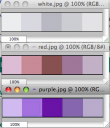
I just whipped this up in a table format but a little separation goes along way
I really like the idea of changing it every so often. Maybe put it on a quarterly or seasonal rotation. CMAA sample.png1280 x 800 - 124K
 -
O yeah! I like this. Now chonak, are you going to set this same pallet for the other liturgical colors of the day as they happen along?
-
OK, I got back the old blockquote styling; and I agree with Mark about that apse, so I pulled in another image to replace it.
Otherwise, I think this'll be adequate for a while.
-
are you going to set this same pallet for the other liturgical colors of the day
http://tinyurl.com/l8pboey -
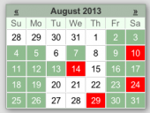
here is the liturgical pallet based on your green pallet
 Picture 2.png261 x 304 - 34K
 -
Isn't that a cute optical illusion: how the dark color makes the center seem narrower than the ends?
-
As I am using this background for reading, I think it is a bit dark for both the personal posts and the other posts.
-
I've bumped up the font size. Formerly it was "small" (80% of normal); now it's 85%.
-
@chonak
I'm not sure which apse you thought I meant, but the one I had in mind is the wide one whose center is just to the right of the word FORUM (at least at my screen resolution). You know, the one that looks super posterized and splotchy, like it was made of wavy lines.
Incidentally, I do prefer the old blockquote style, with the frame, which you've restored, but is it possible to get a button to simply indent a block of text too? -
Yes, that's the apse I swapped out for this one. Maybe the unevenness in the image reflects some irregularity in the windows of the actual building. :-)
For a while I tried having users work with a fancier editor with more features for composing comments, but it didn't work consistently for everyone, so I don't know of a way to obtain indenting.
Thanked by 1MarkThompson -
Or maybe I didn't mean the same apse. Which one is to the right of "forum" depends on the width of your browser window!
-
Could be; I meant this one:

-
Given the NPM convention, I hope it doesn't mean we are green with envy. ;-) Green is one of my least favorite colors, but I can live with it. It is a webpage, not one of Martha Stewart's artistic creations. Wait, maybe the walls of Martha's prison cell were the inspiration.
-
Mark, you're seeing an old version of the graphic from your browser cache. If you clear it, you'll get a different view.Thanked by 1MarkThompson
-
-
I like it, esp. the etching behind the logo. Very artsy. : )Thanked by 1CHGiffen
-
New calendarist revisionist Sergianist. Is outrage! LOL.
-
It's always Ordinary Time at the Forum.
-
Being eastern, the concept of Ordinary Time is a Latin seventies construct created by Paul VI. I still natively think of certain Sundays after Easter, Pentecost, and such. But we are new calendar, while many of the Orthodox are not.
-
Maggie Smith did offer the observation that 'green is SUCH a difficult colour!'.Thanked by 1CHGiffen
-
ooh, I dont like the "routine reminder" currently - it looks just like one of the comments and blends in too much.
-
It is quite identical; well -- except for the background color, the Times font, the indenting, the italics, and the blue box around it.
C'mon, huh? :-)
Ah, well. Not everyone perceives these things in the same way. I'm rather detail-oriented, so little differences stand out to me. -
Welcome to the CMAA Hospital. How may we serve thee?Thanked by 1CHGiffen
-
ehm, sorry... I could swear it looked a lot different (as in the same) when I first posted that!
-
I have a personal reason for not liking beige: I spent the 1960s and 70s living and working in it (my parents were hoteliers in a small town, so I saw a lot of motel decor). Finally, the flashbacks are over. . .Thanked by 1CHGiffen
-
I've put a new (slightly different) set of colors on the forum. Is it still OK for readability and appearance?
Could we just revert it completely? -
This looks pretty good to me. Much easier on the eyes.
-
People with nostalgia for the old theme can play with the theme selector at the bottom left of the page. It has three options:
- standard: the current theme
- CMAA2011: somewhat like the old theme
- original: soemwhat like the default theme for this forum software
I'm sure the results will not look like what you want. It can even mess up how the forum looks for you, if you tinker around.
If that happens,
- delete your browser cookies for "forum.musicasacra.com",
- empty your browser cache,
- close all your browser windows,
- turn off your computer,
- come back later,
- install another browser,
- and use that.
:-)
If it doesn't work, I will not fix it, I will remove it.Thanked by 1MarkThompson -
People at a Catholic traditional music forum are frightened of change?? I'm shocked!Thanked by 1marajoy
-
What is all this talk about change? Was it change in 19th century Russia? It was not! Is outrage!Thanked by 1Adam Wood
-
G:
Hahahahahahahaha! -
changing colors to the forum is not a change in content, it is simply a school of thought.


Welcome to the MusicaSacra Forum!
To participate in the discussions on Catholic church music, sign in or register as a forum member, The forum is a project of the Church Music Association of America.
Categories
- All Discussions21,653
- General Music Discussion8,466
- Job Openings262
- Management of Music Programs858
- Choral Matters538
- Church Documents and Rubrics536
- CMAA Notes307
- Events751
- For Newcomers: Read First26
- Sacred Polyphony563
- Hymnody889
- Gregorian Chant: General2,739
- ↳ Graduale Romanum and Liber Usualis372
- ↳ Graduale Simplex60
- ↳ Semiology65
- Vernacular Plainsong702
- Anglican Use and Anglican Chant70
- Organ, Other Instruments and Repertoire447
- New Composition/Works in Progress1,329
- Recordings237
- Music for Hispanic Ministry162
- Music Education: Children215
- Music Education: General222
- News Items245
- Positions Wanted3
- General Discussion: Catholicism741
- Amusements182
- General Discussion1,044
- Opinions119