
New chant font
-
Hi folks,
I’ve been working on a new chant font which is almost ready for release. I know there are options out there, but this is designed to work within Dorico (music notation software) for drawing the staff lines. It’s also meant to be very easy to use, with entries that are as simple and memorable as possible.
I’ll post some examples here shortly. I can’t seem to link to a photo. Any suggestions there? -
-
I've downloaded the image and attached it for you :)
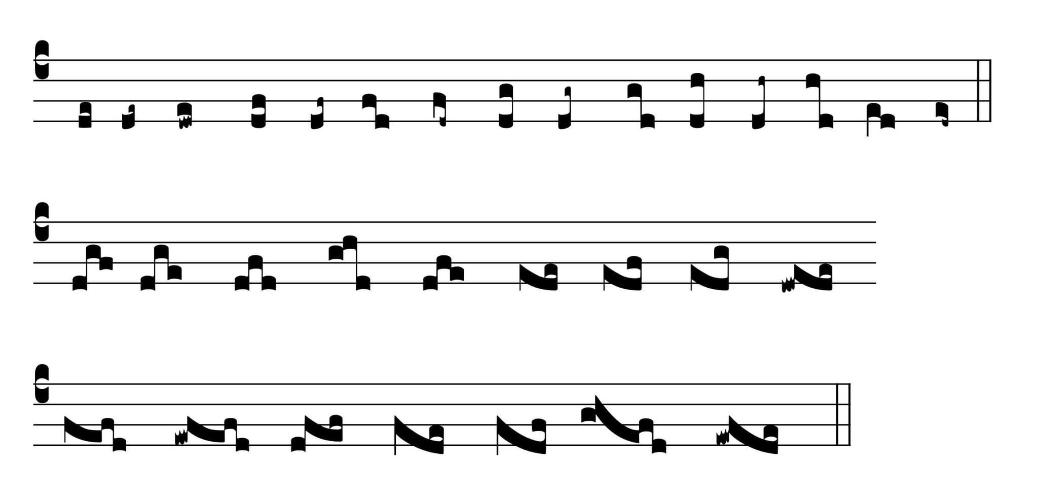
 fZvXW3I.jpeg2048 x 995 - 108KThanked by 1Adam Wood
 -
Second stave, first neume, the third note seems a tiny bit wonky. It is a little smaller and isn't centered on the line.
Something similar for the third & fourth notes of some of the neumes on the third line.
I've also just noticed that your clef isn't perfectly left aligned. There's a tiny bit of stave poking out to the left.
But so far, so good. You've made a ton of progress and improvements in the last week. Bravo. -
Comparing to the Solesmes editions, the first neume looks like it is sitting a bit high. Also, the fourth and eighth neumes should use the same glyph on the bottom note as the first.
-
A brief update: I'm comtinuing to work on this. It's nearing completion. The goal is to be able to replicate everything in Solesmes.
 pic9.png3594 x 1602 - 224K
 -
I don't know what you exactly mean with ‘replicate’, but when I’m comparing with an engraving from Solesmes (Nocturnale Solesmense, 2017, p. 75), there are some striking differences and details you probably would like to reconsider:
- the placement of the horizontal and vertical episemas is inconsistent; sometimes too close to a note head, sometimes too far away; vertical episemas sometimes go through the staff lines
- the shape of your note heads seems to me too wide; Solesmes has more vertically elongated note heads, slightly rectangular
- the lower note of your podatus should be a bit wider and completely square, with straight edges
- the ‘scribbles’ of your quilisma are not evenly spaced
- your bar lines are thicker than the staff lines
- the placement of a series of descending rhombus, as in a climacus, is not perfectly diagonal; the corners of a rhombus from Solesmes is more subtle
- Solesmes puts more space between the staff lines
In general:
- hyphens are placed directly after a syllable; they are a not centered between two syllables
- Latin words of two syllables don’t get an accent to indicate the stress; it’s always the first syllable Ovosomnes-2.png3594 x 1602 - 339K
 Ovosomnes.png3668 x 1918 - 3M
 -
The last is true, but the Liber Usualis adds it anyway…Thanked by 1tomjaw
-
@smvanroode, thanks for the feedback.
1. Yes, I'm working on the episema. Difficult to code but I will fix it
2. My goal was not to exactly copy Solesmes, sorry, "replicate" was not the best word to use. I should have said "be able to reproduce all notation and formatting." I intentionally made the note heads a little wider. We'll see what other users say. If everyone objects, I will change them.
3. Ok, I got completely different feedback from another chant expert on the podatus... also will wait and see what the consensus is.
4. I don't understand regarding the quilisma, can you clarify?
5. Bar lines and staff lines can all be easily changed in Dorico
6. I can adjust the design of the rhombus easily, thanks
7. This is a setting in Dorico
So in summary, some of these things are settings in Dorico that each user can choose. And it is not a priority to me to create an output that is indistinguishable from Solesmes, unless users request it. Thanks again for your feedback. -
FWIW, I've also thought the note heads were a little too wide, at least in proportion to some of the other shapes like the diamonds. You have to remember that we are all used to looking at Solesmes & GABC output, so something that is different just strikes the eye as weird, even if it's perfectly legitimate. So you're really fighting the force of inertia, I'd say.
-
Hmm... that's unfortunate. But as you say, it needs to be accepted by the community. I'll wait for the next round of feedback and an willing to change it, it will just be a ton of work.
I find Solesmes too narrow, but that's just me. I might also consider widening the diamonds. That's valid, for sure.Thanked by 1tomjaw -
I, for one, don't mind the chunkier look - one could argue it will help in visually aligning square and modern notation when used together in the same score.
-
>You have to remember that we are all used to looking at Solesmes & GABC output, so something that is different just strikes the eye as weird, even if it's perfectly legitimate. So you're really fighting the force of inertia, I'd say.
To the point where even non-Solesmes chant was rendered with type similar to that of the Solesmes editions, even for non-musical elements, and because of Gregorio, that style of neume is pretty widely adopted even for non-Solesmes editions of pretty much all kinds of chant today. -
I like the wider font, or in general: I like that it is a font which perceivably different to the standard Solesmes font. It's a bit of variety while still being classical - just as we like to read different typefonts (as long as they follow typographical standards). This font in particular reminds me of the "Vollkorn" font, which is a rather strong and dark font for every day use.
Will this neume font be usable with other software than Dorico?Thanked by 1ServiamScores -
I like Vollkorn... it's one of the few fonts I've seen that has genuine bold typefaces that actually stand out from the regular weight, and it also has æ with a stress mark above it, which is useful for latin chant. Very few fonts include this ligature with the accent mark above it.Thanked by 1tomjaw
-
Thanks. Yes, it will theoretically work anywhere, but it does not have staff lines or bar lines, so it needs to be used in a notation program. I’m sure it can work in Sibelius or Musescore, just not sure how the workflow would be.
-
I, for one, don't mind the chunkier look
As a recovering Finale user, Bravura looks "chunky" to me. So this will fit right in. I don't know how many people will do all-chant projects in Dorico. But for alternatim projects, this is badly needed, and if the look is compatible with Bravura, all the better I say.
Thank you, Dan.
-
When this gets to the point where it is ready to be used, I'd be very interested to know how to use it in Musescore. My vote would be for the skinnier neumes like what gregorio uses.
-
Ok everybody, feedback please. How easy are the current options to use, like Gregorio or Illuminare? Are they painful and slow? How long does it take to engrave a moderately complex 4-system chant, for example?
-
Gregorio is pretty easy once you get the hang of it, especially using Bloomfield's transcriber tool. But all editors are code based, not graphical interface. So now that I've learned the system, transcribing a score is pretty quick, I just type (or paste) the text into the text window (accents and æ are easy to add in Bloomfield's tool), and then I type out the melody in GABC in the other box. If I already have the integrated GABC, it's a quick copy and paste into whatever program I want to do my final engraving with (I use LaTeX).
-
Interesting, thanks. This seems very complex to me, at least a steep learning curve initially. And you don't have fine-grain control of the final output necessarily. But I do see that it's predictable and "safe" once you learn the interface.
I'm asking because MusChant needs to be as easy to learn and work with as possible, or else it's not compelling. I think it's much easier than this. But I'll wait to see what other users say. -
I've long loathed GABC. It works, but I have to keep a GABC cheat sheet for reference taped on the wall next to my desk, I usually want to start with another file already in Gregobase, and then, as you said, there is no fine-control over output (at least not in the main transcriber tools) so then you have to bring the PDF into something like affinity and faff about with it. It's very frustrating to me. And then it has no recourse to exist parallel to modern notation. I use GABC strictly because I've HAD to, because I've been unaware of any other way to accomplish the same thing, apart from Medieval in Finale, which wasn't really an option for me.Thanked by 1tomjaw
-
Well, that's promising to hear. That is, I'm not glad GABC is frustrating, but I am glad to hear that MusChant sounds like a significant improvement in user experience and control. Hopefully it is that.
Thanked by 1tomjaw -
Well. That depends.
LaTeX can be painful to use until you really get into a groove which took me two years and I’m still not the best at the LaTeX side. Gregorio out of the box mostly works fine. I made some adjustments but not too many.
Illuminare should not even be in the conversation. While the editor is free, it’s not clear what actually happens as changes to gabc and therefore to Gregorio made after 3.1 are not accepted as input. It is best for a quick and dirty use of gabc, before finishing in Gregorio (with a local installation or via Overleaf) since live preview is not really possible with a proper Gregorio installation. You also have very limited control over presentation.
I do have a use case for an alternative, no matter the app used in the end, however. It might be way, way easier to notate chant with a sort of figured bass which would require a lot of tedious annotation in a PDF viewer or by hand (even if done with a digital pencil). Redoing the entry is a lot of work, but a score file with PDF output is cleaner and somewhat more permanent than marked-up PDFs or writing on printed copied, and the entry of such would be tricky and complicated anyway. This would require hackery not really possible in Gregorio (unless you use tags for TeX input which is dangerous); there’s no way to attach a text or translation to part of a neume, let’s say the last note of a climacus that carries the printed ictus in a Solesmes edition.
But as I said elsewhere, Gregorio's control of the neumes means that only relatively rarely does one need to tweak its output by adding or removing space controlled by!or/, or to add the virga, to get neumes not possible with the gabc as entered. For those of us reproducing scores, this is mostly accomplished already as Gregobase exists, and a mistake there is trivial to correct, as anyone can contribute.
Gregorio is not good for critical editions, but I don't think that MusChant would be either.Thanked by 1tomjaw -
Gregorio is not good for critical editions, but I don't think that MusChant would be either.
Can you elaborate on this? The goal with MusChant is complete control over literally every mark on the page. What aspect of critical editions are you concerned would be lacking? Thanks. -
Multiple staffs precisely aligned for example. You’d be limited by the software which is independent of MusChant. The Graduale/Antiphonale Synopticum has a custom stack and did everything by hand.
So let’s say it works in Dorico. Cool. Now we’re tied entirely into Dorico (because maybe it’s too finicky in Musescore Studio or whatever) yet the advantage of gabc is not being tied in to anything. People use Javascript to display gabc online, other people run LaTeX online (this is how Gregobase works as well as the editor to display the modern editions of Solesmes with adiastematic neumes from ca. 850, what we call a duplex edition), you can just run Gregorio yourself… you can do something else. You can fork your own version of Gregorio and play with it! It’d be no different than any other custom package.
But as to the point above about learning gabc… I don’t know. I agree that it’s unfortunately not easily readable by humans (although the transcriber tool of Ben Bloomfield makes proofreading easier if you prefer to split text from gabc). But it really just requires some practice, which comes if you find yourself transcribing on a semiregular basis. There’s nothing wrong with having the cheat sheet available in another window or in your office. Most people don’t need the finetuning possible within gabc inside the score (and not as LaTeX in the document, e.g. much of the episema control is done as gabc).
In fact, gabc is hardly the problem. It’s LaTeX.
The reality is that I sometimes also am annoyed that Élie Roux got Gregorio hooked to LaTeX in the early days but if you want fine-control over the output, you have to use LaTeX no matter how you wish to publish your worship aid, teaching materials, or other documents. I know for a fact that the entire Cistercian order will have liturgical books finished in Adobe InDesign, worked on at Heiligenkreuz, with chant produced by their French consœurs presumably in Gregorio and sent as graphics (PDF output is a graphic nowadays!). Matthias Bry is doing the Nocturnale entirely in LaTeX. The FSSP seminaries have a (draft, ish) Vesperale for the 1962 office which was done in LaTeX even more elaborately than Matthias’s work. So while I want to make the case for LaTeX, I acknowledge that it’s not always fun and can be a tool used to ultimately finish in software with a GUI, software used for other design purposes like InDesign, Affinity Publisher, Quarkexpress, Scribus…Thanked by 1tomjaw -
I may not be understanding, but Dorico can be output as PDF, PNG, or SVG even. So displaying it online is quite easy. Granted, it can't be edited online.
-
At least for my own use-case, I desperately desire to have new and old within the same document (as in, modern stemless accompaniment beneath the square note melody, not available elsewhere in another column or on another page) and I really don't know of any other way of accomplishing that apart from what you're developing, Dan. I know someone here on the forum has done it before, but I think it was all done by hand in inDesign. That's just not a feasible workflow if you need to have high and regular output.
I want to help my choir learn to chant from square notes (so stacked scores would be helpful for study) and I also want to write accompaniments but still be able to see the original so I can add the vocal nuances that are lost when the square notes are transcribed. (I'd also like to recreate 5-line versions like one of the experimental german graduals that I linked to elsewhere.)
But I also am not interested in learning to code laTex or LilyPond and cobbling things together with photoshop or affinity publisher. I've lost HOURS editing GABC-derived PDFs to get them to have the spacing I need in AP; it's a tedious workflow, so to be able to manipulate the spacing and other things from within Dorico would be an absolute God-send. -
I may not be understanding, but Dorico can be output as PDF, PNG, or SVG even. So displaying it online is quite easy. Granted, it can't be edited online.
You’re not understanding. It’s that gabc can be used, in addition to PDF output by LaTeX, used independently to be displayed and edited online.
I wasn’t interested either. As I said I don’t always appreciate Gregorio being wedded to LaTeX, and I can accept that LaTeX is a time-suck. But gabc? That is a lot harder to accept, especially as you don’t have to input it in the way it was originally intended to be transcribed.But I also am not interested in learning to code laTex or LilyPond and cobbling things together with photoshop or affinity publisher
But it is quite possible to have acceptable results inserting the graphics the other way around, i.e. do the chant stuff with Gregorio and add graphics of the modern scores. There is now very good LilyPond integration thanks to Fr Samuel.
I actually had the most problems once I tried Gregorio itself and then Scribus (which mishandled the font of the text somehow). So then I switched to only Gregorio and LaTeX, but I passed by Affinity… and I have to say, it was incredibly fiddly with graphics. I cannot imagine what would make a Gregorio score different from anything produced with notation software in that respect.
Anyway it really does seem like using Gregorio and learning to use some other LaTeX packages, as well as other PDF tools if necessary, would be helpful for some users here. I also don’t understand why adapting to the limits of Gregorio or these other tools (Illuminare/Source and Summit) isn’t mentioned. That is to say if your desktop publishing software is imposing requirements that you can’t fix, I’m not sure that dropping Gregorio or not using it and then trying to make the output from the web work with DTP software is any less tedious or easier than just using Gregorio and tweaking it in LaTeX, whether or not you finish the whole product in LaTeX. -
From my point of view Gregorio is easy to learn and use and 90% of what I will ever need is available in GregoBase. That huge database is one biggest advantages of Gregorio. Give it a shot with Bloomfield's tools! The start is rather easy. But I have to say, I was familiar with LaTeX before.
Using LaTeX + Gregorio is a much bigger obstacle: first get it up and running, get a good editor, learning basic LaTeX and then adapt it to your needs (most tutorials are for math and science, so it will not match your needs)... you will probably need somebody to help you.
But it might not be necessary with the only tools, depending on your needs.
Lilypond, although I use it regularly, is still a mystery to me. The syntax is completely confusing, I still don't see the pattern.
What kind of Lilypond integration did Fr Samuel provide to us? -
I desperately desire to have new and old within the same document
That's my primary use-case as well. Choirs that sing chant read square notes; if you give them chant in round notes they get twitchy. And there's a lot of early polyphony that is alternatim (even verses in chant, say) or has a chant incipit. The chant verses are generally not in the manuscript (One finds them sometimes in 18th c, Italian Mss, on 5 lines with chunky Medicean notation that can be approximated well enough with square and rectangular noteheads, at least in Finale; I haven't done this in Dorico yet.). And as a matter of ease of use, the chant needs to be there. Since I'm doing editions for liturgical use, and I'm lazy (and 50 miles from most of the sources I'd need), I use Solesmes* chant rather than trying to find the exact historical dialect of chant appropriate to the music. So something like this would work well for me.
*I note that the Forum software autocorrects "Solesmes" to "Salesmen". There's a joke there somewhere. -
Thanked by 1a_f_hawkins
-
I fail to see how designing yet another square note font brings us closer to the interoperability of chant engraving software.
If people confuse the layers of the chant engraving software stack, they will not go anywhere.
1. Description layer
For scores : the list of notes in a score and their attributes (rhythmic and otherwise). This description can be relative-height, absolute-pitch (like .ly) or absolute-height, relative-pitch (like .gabc). It can be segmented by measure (most fitting for metered
music) or by syllable (most fitting for free-rhythm music).
For printed texts (translations, psalms, readings, rubrics) : the actual text, appropriate metadata (like scripture references and liturgical function), and flags signaling the nature of the text (a rubric, a translation).
2. Structure layer
The ordered list of scores and texts to be included in some publication, with pointers to their descriptions (above).
3. Layout layer
The page size, the configuration of footers, headers and titles, pointers to the fonts used for the text and the music (and their font sizes), anything related to the production of indices and tables of contents.
4. Graphics layer
The actual fonts, images, and other resources used throughout the book that are assembled together according to the other three layers to produce a finished result.
GABC is a description language for chant that supports an extension towards adiastematic neumes (NABC) but does not support polyphony or length stems - yet. Chant described in GABC can be displayed by any software that supports it.
GABC, the description language, is not gregorio, the program that compiles it into a set of calls to a font, nor is it greciliae, the font used by LaTeX to build a PDF from the output of gregorio.
Sure, glyphs in greciliae have their own names and Dorico calls them by different names. This is a trivial issue - the issue of taking two or three hours to make a correspondence table.
Pieces of software that attempt to force every layer to their own standard - their own description language, their own structure language, their own layout language, their own fonts and graphics - are doomed to never be interoperable with the vast ecosystem of chant scores currently in place.
Gregobase has twenty thousand entries, Neumz has about half that, all in GABC, and Repertorium has trained optical music recognition software using GABC as training data, which means the contents of thousands of manuscripts may soon become available as GABC.
Is GABC ideal? No, for many reasons, one of the biggest, as evidenced by this thread, being that it does not play nicely with polyphony and/or modern notation.
But saying "GABC sucks, I'll make a font" ?!? A font is not an alternative to GABC. An alternative to GABC is a score description language with the ability to represent chant, polyphony and modern notation - and if the creator of this language has one teaspoon of wisdom, they will make it so existing GABC can be effortlessly and reliably converted into that more powerful description language.
-
saying "GABC sucks"
I missed that bit.
I need chant notation in Dorico. Now. Pretty straightforward. -
I fail to see how designing yet another square note font brings us closer to the interoperability of chant engraving software.
That's not really the point of Dan's project as I understand it. He's found a way to in essence use neumes as a text layer in Dorico. His impetus was a project to reset The English Hymnal, which contains 4-line chant voices over a conventional organ accompaniment. I think he's seeing that there's more to this, and more possible uses for it, than he thought going in.
We've just discovered interoperability of notation software via SMuFL. And there are a bunch of neume bits in SMuFL, but nobody's SMuFL implementation really allows them to be used effectively. And spending a bunch of developer money on making that possible isn't happening, because the market's too small. I've set chant in Finale, and it was an unlovely PITA. I suspect that unaided Dorico would be the same, plus me not really knowing the program yet. I'm hoping Dan's font will be ready when I'm ready for it, which may be soon. -
@dankreider, do not get discouraged. I am excited for when this becomes available for purchase! I am familiar with how the Source and Summit Score editor works, and while I can create most of what I need, it is very tech/code based. I look forward to when it can be done in Dorico and you've done remarkable with this project!Thanked by 1dankreider
-
Xmarteo is right.
-
Xmarteo is also free as an eagle to ignore Dan’s font.
But it solves a real need for some others in the meantime. -
Yeah, the point is that I can do this extremely easily now. As James says, feel free to use whatever you want.
 pic3.png2832 x 1518 - 167K
 -
NB: updated the pic, but can't manage to delete this comment...
-
I think Xmarteo raised some valid points, yet I think there is no reason to rant. Dan does want he is interested in and what helps him in short term. Fine.
I think it would be good to give it a positive turn: What are the features GABC/gregorio is lacking? I've seen the development has lost pace, the last release of gregorio is from 2021. That's never a good sign for an Open Source project. Collecting new requirements could be a first step to revive it.
Integration with modern notation like in Dan's example would probably need an integration into lilypond or sth else.
PS: Repertorium -- need to look at that, thanks! Does anybody know about a good program for optical recognition for mensural music? I transcribed some falsobordone settings in the past, but it takes a lot of time and is so repetitive... seems like a perfect candidate for automation. -
What are the features GABC/gregorio is lacking
At the risk of getting off topic, I would say:
- Easy and well built way to set multiple lines of text to one line of notation
- Easy ways to integrate with modern notation, especially that from free software like Musescore
- Additional neumes for semilogical/restored editions (upside down qualisma, more/better grace notes, etc)
- Easier ways to make custom fonts for use in Gregorio. I've done a bit in fontforge, but I've run into many difficulties. A custom font builder with simple graphical interface would be an amazing tool, allowing people to replicate notation from all sorts of manuscripts.
- Any other features/programs that would allow us to do tedious operations in bulk or batch (change whether or not two syllable words get an accent mark, use æ instead of ae, import whole books worth of scores from gregobase quickly) -
Xmarteo is also free as an eagle to ignore Dan’s font.
But it solves a real need for some others in the meantime.
I’m failing to see where anyone said otherwise. I just want these things done well.yet I think there is no reason to rant.
I don’t consider that a rant, and I’d know what one is. But if we’re tone-policing like this, then the conversation isn’t fruitful. No one said that Dan can’t do what he wants, but this is a forum of people who might actually use this, and of people who happen to know a lot about chant rhythm, which necessarily includes notation, as we are active church musicians and not secular musicologists who claim to be indifferent to that. That also means getting on the same page about Gregorio and gabc — and defending them as one may see fit.
The feedback can be taken or left.
it’d be better to ask the developers what needs to be done to achieve the current needs. But Fr Samuel has said a million times that a better way to handle lines is needed before doing a lot of things. Knowing precisely where the breaks are only occurs after a first pass when typesetting. This then allows for the typesetting of the space between lines and things like braces for psalmody that require this space to be defined.Collecting new requirements could be a first step to revive it.
Like e.g.: Easy and well built way to set multiple lines of text to one line of notation
That requires something which has long been requested (since at least Gregorio 4.1 I think) and not possible due to this problem. But it is not like the devs are silent about it. I was given this response in the last year or so!change whether or not two syllable words get an accent mark, use æ instead of ae
I understand that ctrl+f can be a bit tedious… but in both cases I don’t see why the package needs to do this. However post it as a feature request.
Fork Musescore to allow for use of gabc or importing gtex files. I don’t think that Gregorio should concern itself much with other programs; the Scribus integration that someone devised is finicky enough, and using Lilypond and importing that to LaTeX may not be good or easy enough but it exists as an option. Otherwise, I am struggling to see why it is so hard to treat Gregorio scores as graphics — but this may well be related to certain DTP programs versus others.
For my part, I would like more clarity in the documentation about features that apply to only the next score versus all following scores until reverting to the default. -
The thing with gabc and the current ways to implement it as something created by an engineering student is that it’s true; it’s not really how I like to work or think about things. I was resistant for a long time. A graphical user interface with keyboard entry or at least an immediate preview and manipulation of spacing, modification of various features by keyboard, mouse, and on-screen buttons has real advantages.
But in a way, it abstracts too, just in a different way from LaTeX; frankly, neither advocates nor detractors understand that. And with chant… well let’s just say that leaving the spacing to the machine, while allowing for manual intervention as needed, is wise. Which is my brief for Gregorio.
Also, with some time and patience, I learned to typeset LaTeX documents at the command line (helpful to troubleshoot, when I don’t need to see the new preview…) and even to (very imperfectly) use version-control software, git in this case, very often at the command line as well.
As to greciliae etc. again, it would not be that hard to modify existing glyphs or to draw new ones. But someone needs to propose them.
And I don’t see why a new chant font can’t be included — or called from your machine if for some reason it can’t be included. Gregoria can’t be included in the package and therefore with TeX distributions, but I’d be surprised if Le Barroux can’t use it at all. -
The issue is that if you're generating graphics for combination with modern notation as in the example Dan just shared, it's extremely onerous to do so. You have no way of dynamically making adjustments to either part to make them work together. At least one of the scores will be a static graphic that, if it needs any adjusting, will require going back to that program, guessing just how much to adjust spacing or whatever, exporting as a graphic, reimporting to another program, comparing, and then doing the whole process over again just because something doesn't line up correctly.Otherwise, I am struggling to see why it is so hard to treat Gregorio scores as graphics
Dan's solution is a dynamic font that allows the two forms of notation to coexist in a dynamic and fluid way. That is a VERY major hurdle to jump. I've been in the habit of importing chant PDFs into worship aids and then tweaking them in affinity publisher. Selecting individual elements of neumes and grouping and then nudging them is a real time suck, let me tell you. And that's only to make fine graphical adjustments to chant-only scores, not combination scores as shown above. Perish the thought of having to use the workflow I just described. -
Yes, I want to be clear about the purpose here, and this will probably be my last comment on this thread. I do appreciate the interaction, even the negative bits. That's part of any creative endeavor and it's fine.
This new font is serving a very specific purpose: being used within Dorico and taking advantage of all its powerful functionality. The point of this post was not "Hey guys, your current tools are bad, here's a better one." Rather, it was to get feedback on design and spacing, which I've gotten.
And if these glyphs can be used within a future system, fine by me. Thanks all. -
Does anybody know about a good program for optical recognition for mensural music?
"Does anyone know about a good program for optical recognition of music?" FIFY, LOL! I sure don't.
Even dealing with published music, symbols are different enough between publishers that things could get tricky. I could see a situation where the software trained on various publishers, and you could set a default for a particular one. I think you would need some kind of AI to deal with translating triple time in particular, because the goal would not be recognizing notes, but auto-transcribing into modern notation. It's a thing to be wished for, certainly, because there's a ton of useful music that hasn't been edited yet, and if that could be automatic, so much the better.
That said, I find inputting your typical duple-time counterreformation church music print to be kind of relaxing. And one of the really nice things about Dorico in that regard is that I don't need to pay any attention to measures, but just enter what I see and let the software deal with barline crossing.
-
reimporting to another program, comparing, and then doing the whole process over again just because something doesn't line up correctly.
TBH I’m way more of a perfectionist than your average bear but with using Gregorio myself and then an adequate notation program, I’ve had good results. YMMV of course. But if you don’t use Gregorio directly and rely on Source and Summit, well, yeah. That’s gonna be frustrating.And that's only to make fine graphical adjustments to chant-only scores, not combination scores as shown above. Perish the thought of having to use the workflow I just described.
As I’ve said, it’s not really fun to learn LaTeX sometimes, but this is the way to go if you only need chant for project X if the online tools provide unsuitable output.
And no matter what you use to get the score… the neume-by-neume adjustment is a lot of work.
-
Over at scoring notes, there is now a really thorough blog post covering this typeface:
https://www.scoringnotes.com/meta/cantorum-a-plainchant-font-for-dorico/
I didn’t have a chance to weigh in on this thread before, but as someone who uses both Gregorio and Dorico every day, I will certainly adopt this. It’s not for everything; I really like Gregorio for chant functionality. But this looks like a really good option for doing bits of chant in Dorico. One example of a project where this would have been great is an edition I did of the Viadana one-voice Mass a while ago, which is in alternatim and needs some chant sections. I did those with Gregorio and importing images into Dorico. -
It’s a bit to wrap the head around, but I’m really looking forward to this. This is going to feature very regularly in my work, for sure.Thanked by 1tomjaw
-
Somebody mentioned an attempt doing the marriage within Indesign. I don’t know if they were referring to the work I did for the creation of hybrid notation, but that is a bit different. The method imports a GABC pdf and then manually superimposes the modern notation accomp below NEVER HAVING TO ADJUST the chant graphic. It also presumes that the chant melody is not played by the organ. Here was one of the latest examples of that experiment using my much preferred variant of the NOH.
The real benefit of this is condensing horizontal real estate, discarding the need for metered notation, and allowing an organist to easily sing, direct and play all at the same time. This also eliminates the need for turning pages which I don’t want to think about when I am praying.
One of my biggest pet peeves in trying to interpret Gregorian Chant with modern notation is that you lose the sense of the timing and flow of the arsis and thesis. It’s like using two brain spaces (schools of thought) at the same time. This method attempts to eliminate that conundrum. The chant really needs to emote a timeless and meterless aura. This is the only way I can think of doing that while it also maintains the Mora Vocis. In my view, setting the chant melody in modern notation stretches the spatial horizontal timing to be much larger than is preferred.
@dankreider
In your example above, I don’t see the need for Gregorian notation. It’s in English and it has a sense of hymn meter. (uses breves and semis) Can you explain why using Square Notes would be a benefit? 825378D8-469A-4B2E-9FEE-777AA5B5503A.png1981 x 764 - 146KThanked by 1CHGiffen


Welcome to the MusicaSacra Forum!
To participate in the discussions on Catholic church music, sign in or register as a forum member, The forum is a project of the Church Music Association of America.
Categories
- All Discussions21,628
- General Music Discussion8,460
- Job Openings260
- Management of Music Programs855
- Choral Matters538
- Church Documents and Rubrics536
- CMAA Notes307
- Events751
- For Newcomers: Read First26
- Sacred Polyphony563
- Hymnody889
- Gregorian Chant: General2,738
- ↳ Graduale Romanum and Liber Usualis372
- ↳ Graduale Simplex60
- ↳ Semiology65
- Vernacular Plainsong702
- Anglican Use and Anglican Chant70
- Organ, Other Instruments and Repertoire446
- New Composition/Works in Progress1,320
- Recordings237
- Music for Hispanic Ministry162
- Music Education: Children214
- Music Education: General222
- News Items245
- Positions Wanted3
- General Discussion: Catholicism741
- Amusements181
- General Discussion1,043
- Opinions119