
Hybrid Notation & Illumination (please add constructive criticism)
-
As a spin off from my Hybrid Notation (see on other threads on the forum) I am also creating digital illuminations. I did one of the Salve Regina a while back... it might be on this forum somewhere.
Here is an illumination (low Rez) of the Pater Noster using a Russian Icon as the background. If you zoom in you will see things you cannot see from viewing at 100%.
In JMJ,
FK
(file is updated, see below) -
Ave Maria
(file has been updated, see below) -
(Oops… forgot the te on the salicus.) Also, I think the dots on the punctum need to be larger. I like using dots between syllables instead of hyphens, and those dots would probably work well for the dots on the punctum. I am thinking of using conventional red staves on the Pater. Will post later on today.
Do you all see anything else that could be improved upon before I start cranking out the rest of the prayers?
The Pater will be the light background template and the Ave the dark background template, and I’m trying to set in place a good prototype template for each. The drop shadow on the neumes kind of works for the light background, but it might be overkill for the dark background.
These are intended for a 6 x 9 devotional booklet for members of the Confraternity of the Holy Face and a newly established Sacred Music Society of Reparation. However, they could be printed as 11 x 17 or larger for scholas that use a music stand and a pointer.
(Found this discussion from 2009)
https://forum.musicasacra.com/forum/discussion/2479/gregorian-chant-and-calligraphy/p1 -
There were a lot of wrong notes in the first Ave Maria... also the Te sign on the salicus was missing. Tweaked some of the neume shapes, put consistent dot (from the text hyphens) on the punctum and refined the shadow on the neumes. Also changed color of Do clef and custos to white. I think I am getting closer to a good template.
 aveMariaRev1.pdf556K
 -
This is an updated Pater Noster with added glowing floating Seraphim and a glowing Christ.
(NOTE: the glows are not showing correctly... they are much more subtle on the source file and I will try to output a pdf that is accurate when I fix the color space.) paterNosterRev3.pdf2M -
pater with better color space... and one with a white glowing Christ.
paterNosterRev4.pdf2M paterNosterRev5.pdf636K -
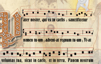
These look nice overall, but the horizontal spacing leaves something to be desired. In the Pater, the text is hyphenated only once, at tentati-onem, and even there the notes are still a bit cramped. In the second line, -niat and Fiat have no more space between the two notes than a distropha, and the end of hodie looks like the second note actually overlaps the first. Of course there's precedent for this kind of cramped spacing in medieval manuscripts, but since you're using Vatican edition bar lines and Solesmes rhythmic markings, it might be more user-friendly to follow the modern convention of leaving the width of a punctum between syllables.
-
@FSSPmusic
Thank you for taking the time to offer comments.
Here is my philosophy:
As a typographer, I lean toward no hyphens to give presidence to the text. I find the wide spacing with a lot of hyphenation to be hard to read naturally as you lose the sense of Latin accent's. The notes get too far spread apart and don’t seem to align with the natural tempo of what one is actually chanting.
Computerized typing has kind of ruined the longstanding art of engraving. If one looks at a Schirmers edition for instance, you will see that the notes are much more condensed, even horizontally compressed.
Also, IMHO, chant engraving has wandered too far away from artistic engraving and too much toward utilitarian ugliness. What one reads (mystical manuscripts) should be just as beautiful as what one is saying (mystical meaning) and singing (mystical aural delivery).
Nevertheless, I will examine your observations and see how I might adjust the issues you have mentioned. I also need to dig out the previous manuscripts of these pieces and compare more closely.
Thanks again.Thanked by 1FSSPmusic -
@FSSPmusic
Hi again...
I downloaded numerous manuscripts from the 10th to 13th century. These seem to be at the height of creating beautiful and mystical manuscripts that are truly works of art. This is what I am shooting to revive in the digital realm utilizing Eastern iconography, as the Roman church (in my regard) lost an incredible wealth of spiritual art when we separated from that arm of the church. These early manuscripts seem to capture that same sentiment. Often, I think art and architecture, and perhaps the music in the Roman rite went in the direction of being mostly anthropological, emphasizing the humanity of the faith instead of the transparency that is communicated from the Eastern tradition. This is reflected in the work of Michelangelo (art), and Mozart (music). These works are based in a kind of sentimentality that is absent in the Eastern tradition if I am saying this correctly as it appears in my mind.
That all said, as I study these various manuscripts, the text is much more prominent (larger) and the notes are smaller to account for the space needed to write the chant above the words without hyphenation.
Later today, I will attempt to recreate that proper blend of elements that is harmonious where one does not overtake the other.
Thanks again for the challenge! examples.pdf723KThanked by 1FSSPmusic -
Francis, FWIW, I like your custom illuminations, but I wouldn't be able to sing from these editions with such strong background graphics. Please consider reducing their opacity or something... otherwise it's overwhelming how much visual clutter there is (ref. your Feb. 5th post with PDF samples).
-
@ServiamScores
wow… that is the simplest request I’ve ever gotten when it comes to a revision to computer graphics! Once I figure out the proper ratio of text to neume size, can easily do!
I can certainly produce a “Serviam Edition”…
1 Make background transparent (or delete)
2 Export to PDF!
A few clicks on fill and shadow styles and here's a sample. (still have to adjust text and neume sizes) paterNosterRev5Serviam.pdf348K -
@FSSPmusic
Here are two examples of reducing the staff size by 10 and 20 percent. The change is made to the first stave only so you can compare to the original below.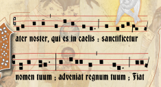 Screenshot 2026-02-06 at 4.26.52 PM.png1281 x 697 - 1M
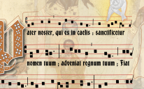 Screenshot 2026-02-06 at 4.30.30 PM.png1150 x 715 - 1M
 -
There is still very little space between punctum when you have a vowel dipthong, so the only elegant solution is to always use hyphenation in those instances. I also applied pair kerning to gain needed space in the text. Here is an example of hyphenation of dipthong with pair kerning. I did this to the first two staves of the three.
 Screenshot 2026-02-06 at 4.47.29 PM.png1225 x 775 - 2M
 -
OK... here is revision 7 which includes reducing the staff by 20% throughout, adding hyphenation to vowel dipthongs, making background a 50% tint, making notation in black without shadows (since white is no longer employed as a reverse). I think that solves the cramped neume issue and makes it much more readable for singing. ;} paterNosterRev7.pdf350KThanked by 1OMagnumMysterium
-
Francis, I definitely agree with you about the need to return to more beautiful engraving for our music books. A balance between practicality and beauty is quick important. I usually opt to put the artwork around the music (drop cap, margins, etc), not behind it. I'm not sure how I feel about an image of Our Lord's sacred face having music sitting over it. But the overlay may be a viable strategy, used judiciously. I commend your efforts to bring back beauty to our books!Thanked by 1francis
-
I’m afraid you misunderstood me: I actually mean the artistic graphics in the background. The whole page is too busy. “Cotidianum” over a seraphim is just a lot of visual clutter. Old books were decorated in the margins, not the body of the chant itself (excepting fancy drop caps, and the chant moved around the graphic, rather than intersect it).Thanked by 1OMagnumMysterium
-
@ServiamScores
I was attempting your first request
I could easily remove backround next go round.Please consider reducing their opacity or something... -
a completely different approach paterNosterRev9.pdf2M
-
It just needed a bit more illumination... was too plain. paterNosterRev9.pdf2M
-
Not sure how I feel about the un-gessoed canvas background. Kind of makes me hungry for coffee ice cream.
-
@Richard Mix
@Richard_Mix
(How does one ping a handle with spaces in it?
Lol… linen paper… its a “simulation” which gets removed once it would print on a VERY nice actual piece of parchment. And final touches would be real gold guilding.Thanked by 1OMagnumMysterium

Welcome to the MusicaSacra Forum!
To participate in the discussions on Catholic church music, sign in or register as a forum member, The forum is a project of the Church Music Association of America.
Categories
- All Discussions21,634
- General Music Discussion8,461
- Job Openings260
- Management of Music Programs855
- Choral Matters538
- Church Documents and Rubrics536
- CMAA Notes307
- Events751
- For Newcomers: Read First26
- Sacred Polyphony563
- Hymnody889
- Gregorian Chant: General2,738
- ↳ Graduale Romanum and Liber Usualis372
- ↳ Graduale Simplex60
- ↳ Semiology65
- Vernacular Plainsong702
- Anglican Use and Anglican Chant70
- Organ, Other Instruments and Repertoire447
- New Composition/Works in Progress1,323
- Recordings237
- Music for Hispanic Ministry162
- Music Education: Children214
- Music Education: General222
- News Items245
- Positions Wanted3
- General Discussion: Catholicism741
- Amusements182
- General Discussion1,043
- Opinions119