
Music Engraving Bezier Curve Comparison : Sibelius / NOH / Brietkopf
-
I am setting some GC and decided to do a comparison for best practices in notation since I am refining my hybrid notation method. This method uses chant notation for the top staff and then modern notation for the succeeding staves for instruments.
Here are my findings.
Sibelius tends to use 'fatter' noteheads. (easier to read, especially by older people???)
The NOH uses only two noteheads, half and quarter. They tend to be close to the size of the Brietkopf edition.
Brietkopf is a bit smaller all the way around, and the whole note is horizontally more compressed... interesting. Also the accidentals are much smaller so they can fit in and not take up too much real estate to leave room for other elements such as ties, slurs, stems, etc.
Of course, Brietkopf is the oldest and longest standing publisher (I think) and has stood the test of time (and worthy composers)... I am going to base my chant manuscript hybrid notation after the sizes of Brietkopf. Sample pending.
I am building a library of elements for both chant and modern notation which will be pulled into a page layout app for best rendering.
Here was the original idea from 10 years ago.
https://forum.musicasacra.com/forum/discussion/3117/koerbers-hybrid-chant-notation-and-the-noh/p1 -
Here is where this project is going... I am composing organ accomps that are modal, very similar to the NOH... unobtrusive but beautiful in their own way.
PDF and MP3 attached KoerberLitSanOrg.pdf788K hybridSample.mp34MThanked by 1m_r_taylor
 -
I like it. One slight suggestion: Even though not strictly needed, it would be helpful to have the b-flat marked in the accompaniment in every chord (unless tied).
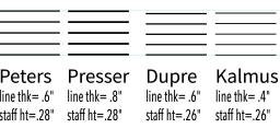
I decided to take a look at Carus Verlag and Baerenreiter. It looks like CV & Baerenreiter both use the same typesetting/font. They seem pretty similar to the Breitkopf score here, except that the whole-notes (semibreves) are a little rounder and more "vertical" in CV & Baerenreiter than in Breitkopf. -
The larger noteheads in the traditional Breitkopf scores are much easier to read and superior typographically. I would not recommend using Sibelius's default Opus font for a variety of reasons; the two best "off-the-shelf" available fonts are November 2.0 and Norfolk (a port of Dorico's Bravura font). Unfortunately its compatibility is quite limited vs. Finale and LilyPond, or I would have suggested even better fonts. (This is extremely close to the late-19th-century Breitkopf example you provided.)
-
@Schonbergian
Yes... that is a great font.
I am able to manipulate the vectors in illustrator and make my own best case scenario. Using Opus, I created the other two simulations if you will of Brietkopf and NOH. They are derrivatives of Sib.
You know, I don't have enough projects going at any one time, so I might as well add making the "BrightKOERf" font at some point. :)
This is a font I made a few years ago for the eclipse endeavor... extremly minimalist, but also moon worthy... called umbra.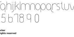 umbraFont.jpg1157 x 332 - 51K
 -
A very interesting project and nice harmonization (if I'm reading aright, I presume the the parenthetical chords would ultimately be centered under the ij., yes?).
Bright is spelled like Frankenstein, of course ;-)Thanked by 1francis -
Thanks Schöenbergian. I'm still plugging away with Sibelius 6 but I was considering switching to Dorico just for the decent font as Sibelius just doesn't look professional. I write all my scores by hand and while I do like Sibelius it has limitations making the workflow for getting free-looking scores very annoying. I generally know exactly how I want the score to be laid out ahead of time but it's always a maze trying to wring it out of the program.
November 2 looks really gorgeous.
And nice work Francis on the score, that's really pleasing to the eye.Thanked by 1francis -
My Goodness this is neat! Stunning engraving too. How on earth do you do this?
-
@ServiamScores
It uses a number of apps to create these scores...
Vector
Raster
Music Scoring
Layout
Being a graphic artist since 1985, I have been using professional production apps since they first arrived. (Adobe Illustrator, Photoshop version 1.0b). I became a "vector geek" as soon as I started experimenting with bezier curves and then employed myself in the emerging digital economy to raise a family since church jobs couldn't pay the way.
Simply, I create the modern notation in Sibelius, create neumes and other objects in the vector program (ie., Illustrator, Affinity Designer, etc.), raster graphics (such as the init cap background and shadow horses) in Photoshop or GIMP, and then put it all together in a layout app (InDesign, Affinity Designer, etc.)
The text dictates everything. It is the first thing I generate, which is done in the layout program since it employs professional typographical tools. (pair kerning, tracking, etc.) Then the chant is overlayed on the text. Then the organ parts are played into Sibelius on a MIDI keyboard (composing and engraving in the same step). That is then brought into the layout program. The illumination is the fun part.
[NOTE: Doodling... I was always doodling when I was a child. In fact, my school papers all received harsh criticism because all in the margins I would always draw 'unacceptable' matter... I was told that I was too much a daydreamer over and over. I had to make that daydreaming pay off somewhere!]
So, in the end, this project satisfies many of my interests. Music composition and engraving, singing and promoting Gregorian chant, playing the organ, typesetting, vector illustration, design and finally, publishing.
I am hoping to transcribe the NOH Requiem Mass in the not too distant future. However, I would also be interested in commissions if there would be any interest. -
The amount of manual labor required for a single page is astonishing. This is really very neat though.
-
@ServiamScores
It does take time to create these, but it is somewhat akin to creating illuminated manuscripts I suppose.
It is very easy reading for singer and organist and keeps the two together. It also is great if the organist is going to chant.
On the other hand, now that I have the template set up in each app, it goes pretty fast. I did three pages yesterday from start to finish and that included composing the organ parts.
I was using GABC to create the chant parts, but I did not find it flexible enough to do text pair kerning, spreading and spacing, etc. (I will admit I only used it for 10 hours for the Chant booklet we made in another thread.)
I will calculate the engraving of a single page with four lines of chant and two grand staves and report back.
O... I also just got a Huion graphics tablet (Gregorian Chant Parchment Edition) which makes this go three times faster than using a mouse... and my wrist doesn't hurt any more. :} (see photo atttached)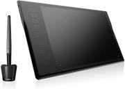 q11k.jpg466 x 331 - 11K
 -
Another thing that I am doing is when I have set the type and the chant line, I print a page and then compose like this with a REAL PENCIL! (see attatch)
I find that I am able to enter into composing music that is more reflective of the text in this fashion. For instance, it became clear to me that the second line of the chant in this page is reflecting our plea to the martyres of the faith and so I veered from pure modal writing and entered an F sharp to reflect the severity to which they had undergone in their adherence to the faith. A small departure, but has a significant effect on the music.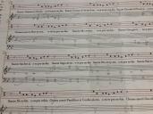 IMG_3278.jpg4032 x 3024 - 3M


Welcome to the MusicaSacra Forum!
To participate in the discussions on Catholic church music, sign in or register as a forum member, The forum is a project of the Church Music Association of America.
Categories
- All Discussions21,650
- General Music Discussion8,466
- Job Openings261
- Management of Music Programs858
- Choral Matters538
- Church Documents and Rubrics536
- CMAA Notes307
- Events751
- For Newcomers: Read First26
- Sacred Polyphony563
- Hymnody889
- Gregorian Chant: General2,739
- ↳ Graduale Romanum and Liber Usualis372
- ↳ Graduale Simplex60
- ↳ Semiology65
- Vernacular Plainsong702
- Anglican Use and Anglican Chant70
- Organ, Other Instruments and Repertoire447
- New Composition/Works in Progress1,328
- Recordings237
- Music for Hispanic Ministry162
- Music Education: Children215
- Music Education: General222
- News Items245
- Positions Wanted3
- General Discussion: Catholicism741
- Amusements182
- General Discussion1,043
- Opinions119