
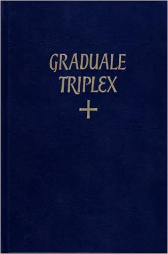
Graduale Romanum/Triplex Title Font
-
Has anyone noticed the subtle differences in the font on the top line versus bottom line of the Solesmes Graduales?
The 'R's on the two lines are different (the bottom one extends below the baseline), and the 'E's in the Triplex title are completely different. What is happening here?
Relatedly, the curve of the 'P' in the Triplex title does not connect, a la Garamond, but it isn't Garamond. -
I will tell you that I am anxiously awaiting the day when my triplexes need to be re-bound so that I can get rid of this particular typographic aberration.
 Thanked by 1Adam Wood
 -
So why does the bottom contain the swashes (and maybe that 'G'?) but not the top? Is it a matter of not interfering with text below text?
-
The second E looks like a 3 as in tri-plex... just a guess.
-
Solesmes covers during the 1970s and '80s weren't consistent in their calligraphic lettering.
On the cover of "Gregorian Missal", "Gregorian" appears in mixed case while "Missal" is fully capitalized.
The epsilon-style "E" in "Triplex" appears again on the Offertoriale Triplex, but not on other covers where it might: "Liber Hymnarius", "Psalterium Monasticum", etc.
The calligraphy stopped appearing on new Solesmes editions at least ten years ago. The 2005 Antiphonale Monasticum, volume I, has a typeset cover title.
Thanked by 1Salieri -
DEO GRACIAS, ALLELUYA, ALLELUYA.


Welcome to the MusicaSacra Forum!
To participate in the discussions on Catholic church music, sign in or register as a forum member, The forum is a project of the Church Music Association of America.
Categories
- All Discussions21,622
- General Music Discussion8,456
- Job Openings259
- Management of Music Programs855
- Choral Matters538
- Church Documents and Rubrics536
- CMAA Notes307
- Events751
- For Newcomers: Read First26
- Sacred Polyphony563
- Hymnody889
- Gregorian Chant: General2,737
- ↳ Graduale Romanum and Liber Usualis372
- ↳ Graduale Simplex60
- ↳ Semiology65
- Vernacular Plainsong702
- Anglican Use and Anglican Chant70
- Organ, Other Instruments and Repertoire446
- New Composition/Works in Progress1,320
- Recordings237
- Music for Hispanic Ministry162
- Music Education: Children214
- Music Education: General222
- News Items245
- Positions Wanted3
- General Discussion: Catholicism741
- Amusements181
- General Discussion1,043
- Opinions119