
Choir Robes get Stylish
-
Buzzzzz...
-
Except that they aren't choir robes.
One would never guess that they were Catholic, would one?
This is sort of in the same category as Episcopal 'Bishop' Schorri'smitrehat, isn't it?Thanked by 1irishtenor -
They're meant to look like something vaguely priestly.
They fail.
-
Not 'vaguely priestly', but blatantly beastly.
Actually, they look sort of like bumble bees.Thanked by 1Reval -
Tenors are red. Original series red, or Next Generation red? Their lives may depend on it!Thanked by 1eft94530
-
Beam me up scotty
-
-
I suppose it is worth pointing out (or not...) that the choir itself is from Hope College, which is not Catholic (but somehow associated with the Reformed Church in America).
As for the story...it doesn't help. At least this part is true: "No one would ever describe these robes as subtle".Thanked by 1NihilNominis -
Eames. Furniture designers. Figures. Any clothing designer would know that people are not supposed to be dressed in horizontal stripes.
I think it's sweet that they had a corporate choir, though. -
It looks like the prison choir.
-
Those choir robes make them look fat. Horizontal stripes were a bad idea.
-
Beam me up scotty
I thought they would have made good alternative costumes for "Logans Run", thats if they could have found the extra funding to buy the yards of extra fabric per Actress.
If only we could have arranged a concert for them here, photos 3 & 4
http://www.newliturgicalmovement.org/2014/01/a-wreckovated-church-gets-un-wrecked.html#.Vf3ADesyw70 -
They look like stacks of poker chips.
-
i like these better
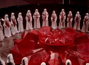
hahahahaha... yes, please keep them in the art gallery.among the most influential designers of the twentieth century... The robe colors are intended to symbolize the four primary voice parts, from highest and brightest (yellow) to lowest and darkest (purple). The black horizontal lines represent an extended grand staff, and the other black swatches stand for random notes in the universe. Purity of tone and faith are represented by the prevailing white that appears on every surplice. No one would ever describe these robes as subtle; they are very much in line with the bold and quirky designs of mid-century modernism. But, as the work of Charles and Ray Eames, they hold a special place in twentieth century art and design, and would be at home in art galleries everywhere.
 carousel23.jpg1150 x 850 - 142K
 -
Wonder if I could get chartreuse, half way between yellow and green for my basses. This to indicate that sometimes they approach pitch in one direction then another.
-
I'm surprised that no one has mentioned Aida...
-
It looks like the prison choir.
Were you a member long? Or just part of the general congregation.
-
At least discerning ears in the audience will have an easier time finding which group of souls to stare at judgementaly when intonation goes askew.
-
Some things just cannot be unseen. I liked them fine until that poker-chip crack.Thanked by 1CHGiffen
-
Its not the design that is particularly the problem it's that it all says "look at me". The purpose of robes is really not about being seen but being a ubiquitous whole.Thanked by 1CHGiffen


Welcome to the MusicaSacra Forum!
To participate in the discussions on Catholic church music, sign in or register as a forum member, The forum is a project of the Church Music Association of America.
Categories
- All Discussions21,653
- General Music Discussion8,466
- Job Openings262
- Management of Music Programs858
- Choral Matters538
- Church Documents and Rubrics536
- CMAA Notes307
- Events751
- For Newcomers: Read First26
- Sacred Polyphony563
- Hymnody889
- Gregorian Chant: General2,739
- ↳ Graduale Romanum and Liber Usualis372
- ↳ Graduale Simplex60
- ↳ Semiology65
- Vernacular Plainsong702
- Anglican Use and Anglican Chant70
- Organ, Other Instruments and Repertoire447
- New Composition/Works in Progress1,329
- Recordings237
- Music for Hispanic Ministry162
- Music Education: Children215
- Music Education: General222
- News Items245
- Positions Wanted3
- General Discussion: Catholicism741
- Amusements182
- General Discussion1,044
- Opinions119