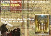
Can some image master make an ad for Dr. Mahrt's book?
-
I've had several requests. Can someone make a cool ad, with an innovative and snappy headline?
Format can be .jpg or .png and I suspect that we need 150 to 300 dpi.
Interested? please please? Truly, i'm terrible at this stuff. -
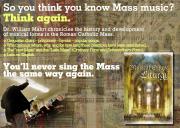
CGM, I'm finding the text just a little hard to read. Maybe a layer with a semi-transparent white fill (or something similar) could be added below the text over the background?It just looks kind of busy.
But it looks really great otherwise. -
Ben - thanks for the feedback. I had already done that, actually, and for that precise reason. On my computer there aren't any legibility issues. Maybe it's a scaling/size thing? (It's a pretty large image, and should be viewed at full-size, if possible. I was shooting for something print-worthy, aka relatively hi-def, per Jeffrey's initial request.)
-
I clicked it and blew it up, but the text just doesn't seem to pop out to me. It's legible, it just doesn't stick out and say "Read me!" (if that makes any sense).
-
CGM ... Except for the background being too bright, this is really quite good. A darker, more muted background would bring out the text much better.
-
I agree, the overall concept is great, but the background is both too bright, and because of the color, the cover of the book isn't visually distinguishable against it. I also think it's a bit busy; the church + the manuscript on top of each other are too much. Plus, those big vertical stripes in the middle (it looks like they're from the manuscript?) seem like they ought to be dividing something, but they're not.
-
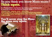
OK, folks - I don't really believe in design-by-committee, but I am very grateful for your feedback nonetheless. Here's option 2 - and I'm waiting for the ol' JT to weigh in himself!
 MahrtBookR.jpg1332 x 949 - 2M
 -
I like the contrast on the red one.
-
Me, too.
-
These are really fun! but there really is too much text, too much to take in in a small advertising. How about just the headline and otherwise total graphical clarity. Possible?
-
Please consider a 1–3pt wide dark outline around the text—it will help the words pop out more. (I'm looking specifically at the text "You'll never sing the Mass the same way again.")
-
Jeffrey, how will the image be used: as a blog ad 250 pixels wide? As a pop-up ad 600 pixels wide? As a printed piece?
Also, is there a similar photo that shows Dr Mahrt's cheery countenance? -
Well, actually it is for a print publication. I should have specified that. Maybe a quarter page or so.
-
and now for something completely different
(lo-res version)
 Mahrt2.jpg1200 x 1553 - 360K
 -
I like it!
-
Me, too!
-
A tip: from what I read on the 'net, images designed for printing on paper should have a resolution of at least 300 dpi, and 400 if they contain text.
-
The forum won't let me upload the full resolution file - 7.4 Mb.
Jeffrey, if you like the little one, I'll get the big one to you. Let me know!
Or download it from this site - this is a free file-sharing website, but it deletes each item seven days after posting. This link is good until April 2, 2012:
https://www.yousendit.com/download/ M3BuYURBaFJLVlhOUjhUQw
 Mahrt2.png2318 x 3000 - 7M
 Mahrt2.png2318 x 3000 - 7M
 -
I like it.
-
Yeah we could use any of those above if we were being fancy...
Or..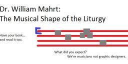
 mahrtjoke.jpg605 x 278 - 43K
 -
Nice, Matthew...
Welcome to the MusicaSacra Forum!
To participate in the discussions on Catholic church music, sign in or register as a forum member, The forum is a project of the Church Music Association of America.
Categories
- All Discussions21,470
- General Music Discussion8,389
- Job Openings240
- Management of Music Programs853
- Choral Matters535
- Church Documents and Rubrics531
- CMAA Notes306
- Events741
- For Newcomers: Read First26
- Sacred Polyphony558
- Hymnody885
- Gregorian Chant: General2,723
- ↳ Graduale Romanum and Liber Usualis372
- ↳ Graduale Simplex60
- ↳ Semiology65
- Vernacular Plainsong701
- Anglican Use and Anglican Chant69
- Organ, Other Instruments and Repertoire443
- New Composition/Works in Progress1,307
- Recordings237
- Music for Hispanic Ministry162
- Music Education: Children213
- Music Education: General222
- News Items245
- Positions Wanted3
- General Discussion: Catholicism741
- Amusements179
- General Discussion1,042
- Opinions119


