Gregorio Chant Engraving request (for projection slides)
-
Open letter to Chonak:
Thank you for the Gregorio Chant Engraver that you make available:
http://run.gregoriochant.org/cgi/process.pl
Would it be possible to add another option for paper size?
I'd like to be able to select a 4x3 ratio for page output.
The reason for that is that it makes it so much easier to format musical notation for projection on a screen if the engraver's output pages are generated using the same dimensions as the slides for projection. Then I can simply turn each pdf page into a separate jpeg file and insert each full-size jpeg on a different slide. That way the staff formatting is even on both sides of each slide, it looks professional and attractive, and I don't have to spend copious amounts of time cutting or pasting or editing or adjusting images.
To head off the anti-projection screen naysayers: I have to make projection slides; pastor insists and the congregation prefers the screen to hymnals or printed music. So I'm going to try using the screen to display chant notation when we sing chant; I want to display neumes instead of modern notation when we display chant music.
If you would please add a 4x3 page layout option to your engraver, I'd greatly appreciate it.
Thank you. -
Thank you very much.
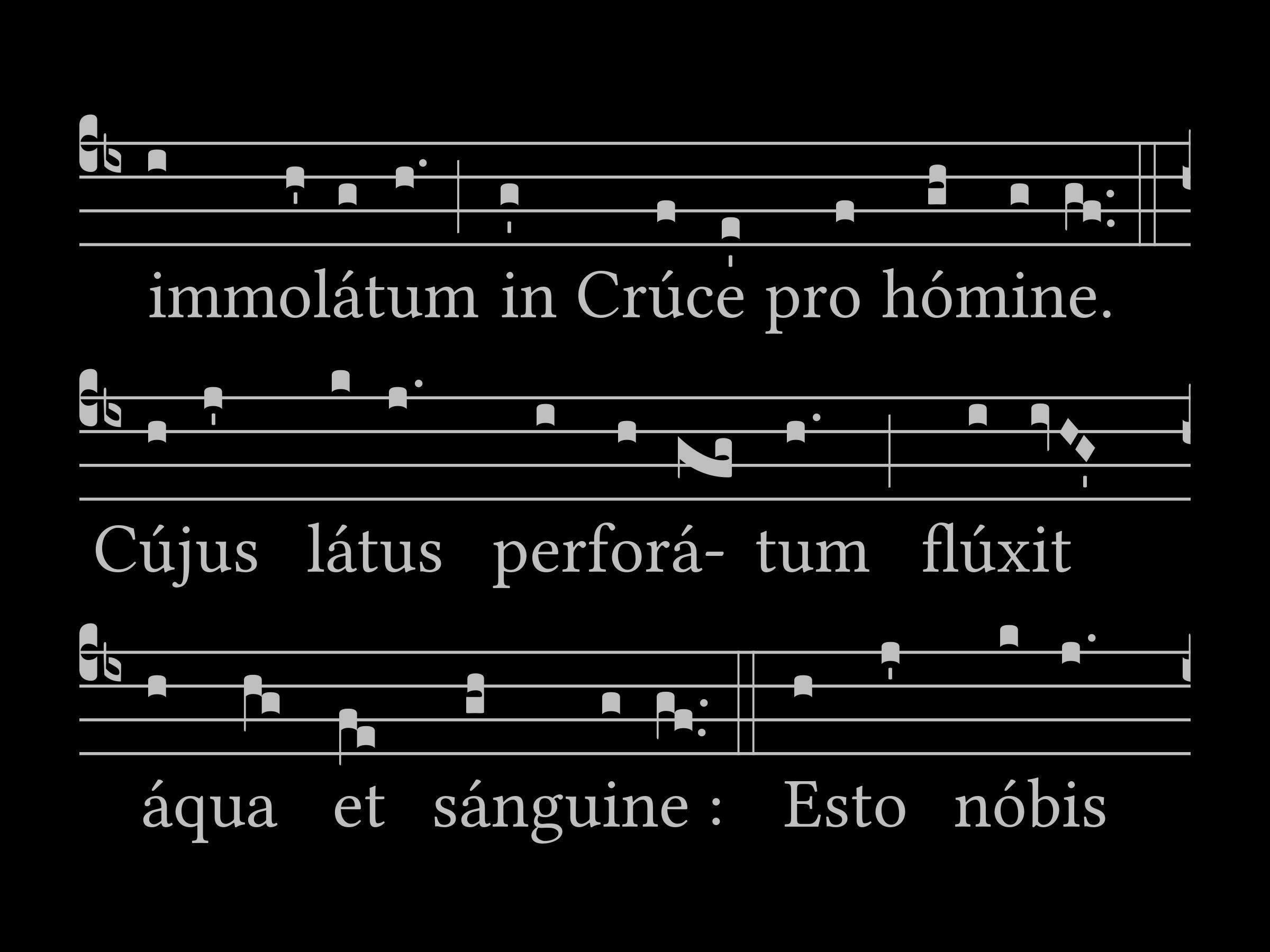
For a test I retrieved the GABC for Ave Verum from Gregobase. I experimented with increasing the music and font size on your engraver to nearly the maximums, and I added a few (z) codes to the GABC to achieve natural, pleasing line and page breaks.
For those who have little experience with creating projection slides for Masses, the text and music have to be BIG, BIG, BIG if the slides are to be successful so they can be easily read from everywhere in the church. Makes it challenging to format music to display clearly.
For those interested in seeing what it would look like as a slide:
I think this will work splendidly. Thank you, again.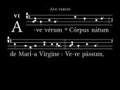
 0001.jpg2400 x 1800 - 231K
 0002.jpg2400 x 1800 - 354K
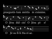
 0003.jpg2400 x 1800 - 348K
 -
And with a little more tweaking of the formatting and adding more (z) codes to the GABC, the music can be arranged on each page using the engraver so that there is room at the bottom of each slide to provide a translation.
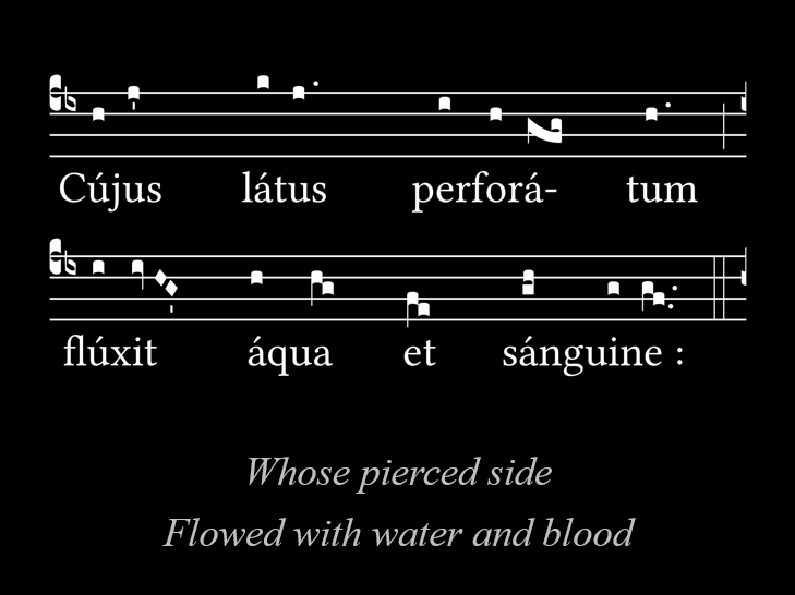
If I have to make slides, I'm going to do it well, and I'm going to maximize the opportunities for edification that it can provide.
 Annotation.png729 x 546 - 47K
 -
It's irritating up close, I agree, but at the distance from which people view in the church it's actually the best option. When I switched from black text/graphics on white background to white text/graphics on black background the response was universally that it was a tremendous improvement in contrast and clarity.
-
This seems to be the successor to the classic use of a large score on an easel!
Welcome to the MusicaSacra Forum!
To participate in the discussions on Catholic church music, sign in or register as a forum member, The forum is a project of the Church Music Association of America.
Categories
- All Discussions21,474
- General Music Discussion8,391
- Job Openings240
- Management of Music Programs853
- Choral Matters535
- Church Documents and Rubrics531
- CMAA Notes306
- Events741
- For Newcomers: Read First26
- Sacred Polyphony558
- Hymnody885
- Gregorian Chant: General2,723
- ↳ Graduale Romanum and Liber Usualis372
- ↳ Graduale Simplex60
- ↳ Semiology65
- Vernacular Plainsong701
- Anglican Use and Anglican Chant69
- Organ, Other Instruments and Repertoire444
- New Composition/Works in Progress1,308
- Recordings237
- Music for Hispanic Ministry162
- Music Education: Children213
- Music Education: General222
- News Items245
- Positions Wanted3
- General Discussion: Catholicism741
- Amusements179
- General Discussion1,042
- Opinions119


