
Font Facts
-
Um, how do you like the 'g'?
The g and G in High Tower are both very nice.It seems to me that upper case R's are amongst the most difficult and least succesful letters of most any font, even of those fonts one really likes.
YES.[Ben Whitworth's sample]
Very nice. Thanks.(I know, I know, I am convinced by all the arguments for the superiority of Gregorio, but I am a humanities graduate and LaTeX makes my brain hurt).
My degrees are in music and theatre.
SUCK IT UP WHITWORTH!
No but seriously, do I need to make a video or something?
Thanked by 1Ben_Whitworth -
No but seriously, do I need to make a video or something?
If you do, I promise I will give it a go.Thanked by 1Adam Wood -
I'm sure it's common knowledge, but what does Solesmes use?
Does anyone know?
I've looked at it and they seem to use several different fonts for different things. I've tried analyzing it with What the Font, but I never get a good result.
If anyone knows what they use for chant lyrics, I'd be very curious. -
'... but what does Solesmes use?''Does anyone know?'
Well, whatever Solesmes uses, it isn't the 'Solesmes Method'!
(And, more precisely font-wise: I seem to remember that Mme. Bergeron (Decadent Enchantments) discusses the special fonts that were developed for Solesmes chant books. There were actually, if I remember correctly, font wars by the various entities involved in gaining primacy for their chant editions.)
Thanked by 1CHGiffen -
I like the letter R. There it sits, week after week, valiantly trying to encourage active participation, yet ignored by so many. A real little tryer that R.
-
But what does Solesmes use?
I believe that the font used in the Solesmes editions from the 1980's onwards is of their own design.
-
I very much like Calisto and switched to it about 2 years ago.
 Easter 6B.pdf2M
 -
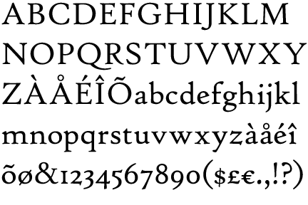
I like High Tower Text for special occasions.
 High Tower Text Sample.jpg407 x 301 - 45K
 -
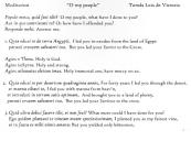
Look at that beautiful Q! -
I chose that sample because it illustrates of why we fret over this. That beautiful "Q" makes the phrases that begin with "Quia" in the reproaches read more expressively.
-
Am I the only person who doesn't really care too much about font so long as it's readable? I certainly do like some better than others but it's not something that keeps me up at night.
-
FWIW, I used Garamond for my Holy Thursday and Good Friday programs, Book Antiqua for the Easter Vigil, and Calisto on Easter Sunday, with different fonts for headings. They all looked good to me!Thanked by 1Gavin
-
I use Garamond whenever my profs don't specify the font. I will use it in programs, I think, but I'll definitely consider others from this fascinating thread.
We actually had a little get-together last night with my classmates and professor to celebrate the end of the semester, and one of our students is a communications major focusing on graphic design. I mentioned that presentation for things like worship aids is important (totally riffing on Adam's paradigm!) and my classmate was thrilled we had a whole thread dedicated to this topic.
I really need InDesign, not only because Word is difficult but because the fonts are better... -
I used Garamond for my Holy Thursday and Good Friday programs, Book Antiqua for the Easter Vigil, and Calisto on Easter Sunday,
This is utter insanity.Am I the only person who doesn't really care too much about font so long as it's readable? I certainly do like some better than others but it's not something that keeps me up at night.
I don't really care about music and liturgy either, as long as I can hear all of it.
-
'...music and liturgy either, as long as I can hear all of it.'
Perhaps this adamantine pronouncement is to be taken 'tongue in cheek'?
There is quite a lot of music and liturgy that I would rather not hear at all.
In fact, I have got up and left because of some things that I did not want to be hearing.
-
[insert joke about the blessing of the font here]
-
If there is information about a font and the back of a book, I usually read that first.
I worked at a newspaper for 24 years, so I know a bit more about fonts than the average... And I like very much what I see here. I belong to the society for the prevention of san serif fonts (SPSSF).
FWIW, I produced a worship aid entirely in Garamond, and it looked elegant. Nothing like a Drop Cap to call attention to a new section. Drop 3 lines for everything, except for the initial letter of the gospel, that takes 4 lines.
In The Episcopal Church, there was an altar missal, The American Missal, that came from the [Episcopal] Cowley Fathers and Brothers in Cambridge, Mass. The typography there is exceptionally well done. Beautiful, AND functional. The Headlines for First Class feasts are noteworthy. That book is only nowhere, but the Manual for Priests is, but the typography is not as elegant. But it is large.
Sorry to be Johnny come lately here. -
Ah. The Cowley Fathers (amongst others) and The American Missal. What fond reminiscences! Those really were the days when there actually was hope for the Anglican Church. It's not bad enough that that church will now bless just about anything except orthodox Christianity, even famed and staunch old Anglo-Catholic parish bastions and dioceses have made their peace with priestesses and all that comes in their train.
And, what a delight that there is such a thing as the SPSSF! I have often thought that designing and working with fonts must be amongst the most wholesome of professions. -
For Adam... (sorry to wake a sleeping thread..., it's been a while since I've been here. I found the thread by accident when I typed in "Are Palatino and Garamond the Catholic Fonts?" into Google. Hit no. 4.)
"If someone has designed a typeface that looks like this, I want to know about it."
There's some similar ones, at least for lower case. You could try these:
Vectis Miniscule is pretty close, and so is Artimus [edit - Artimas] Regular. I don't know if they are ligatured, they're both pretty cheap for that kind of detail.
 Vectis Miniscule.png720 x 41 - 4K
 Artimus Regular.png720 x 37 - 4K
 -
I do have to mention why I would look up: "Are Palatino and Garamond the Catholic Fonts?" on Google, It's kind of funny.
I'm typesetting something - not music - and I took a look at my bookshelf. The spine of everything on the first shelf newer and Catholic is Palatino or Garamond. Even OCP Spirit and Song is Garamond with a serif haircut.
Then I said: "Aha! here's something with my Shakespeare that's not Palatino or Garamond." But no, The Quest for Shakespeare is Ignatius press. Catholic.
Then on another shelf next to "Death Comes for the Archbishop," (Not Catholic), was a book titled: Parish Priest. Garamond again.
Then I turned around and Googled: "Are Palatino and Garamond the Catholic Fonts?"
I attached images of the shelves.
BTW- For music (modern style) I use Tex Gyre Schola, Type 1 Postscript. I think there is an OTF available. It's a LaTeX font based on a Ghostscript font. It's a version of Schoolbook that's a little widened and I think more readable in print. The screen fonts aren't that great, though.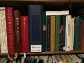 IMG_0086.JPG4032 x 3024 - 2M
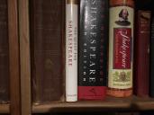 IMG_0087.JPG4032 x 3024 - 2M
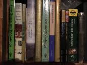 IMG_0088.JPG4032 x 3024 - 2M
 -
Palatino has been available for free ever since it was adopted as one of the standard fonts in every laser printer that implements Postscript, so that status has probably help popularize it.
I suspect that Garamond is used in many religious projects because people admire the typesetting of the (Episcopal Church) Book of Common Prayer 1976, which is set in Sabon, a variant of Garamond (as Adam Wood mentioned way back on page 1 of this thread).
Sad to say, the folks at Ignatius set their music books ("The Adoremus Hymnal", Fr. Weber's "The Office of Compline" and "The Proper of the Mass") in Times font, so they are less attractive than the publisher's prose works.
-
By the way, the Vectis and Artimus fonts which SeasonPsalt cited are much more readable than the manuscript Adam posted: the lowercase "e"s in that page have such a tiny "eye" that they make it hard to distinguish "e" from "c".Thanked by 1Adam Wood
-
@SeasonPsalt
I found Vectis on MyFont.
Where did you find Artimus?
(I found a font by that name which is all future and wingdingy) -
My apologies, Adam. Artimas - with an "a." That's my bad.
http://www.myfonts.com/fonts/bergsland/artimas/regular/
-
I suspect that Garamond is used in many religious projects because people admire the typesetting of the (Episcopal Church) Book of Common Prayer 1976,
You know, you may be right. I had hypothesized it was because Catholic graphic designers all attended pretty much the same universities, but actually it may be because they admire the same kinds of works.
When I was in Germany - this is two decades ago, and things change, the popular fonts for titles and spines there on worship aids, etc. for both Catholic and Protestant was a modern Uncial that looks sort of like the attached. I don't know the history.
I am pulling this look from my faulty memory, though. This one's called "ElecrUnciale" by Manfred Klein, he has a lot of very cool Uncials, but his archive is difficult to navigate.
http://moorstation.org/typoasis/designers/klein/index.htm ElectrUnciale.png1487 x 94 - 21K
 -
When I think Catholic font I think of Kells, and the vatican website fonts Trajan and Charlemagne!
 sss.jpg910 x 754 - 617KThanked by 1CHGiffen
 -
What is wrong with Times New Roman???? I use it everyday at work.
-
Times font was designed for efficiency in printing newspapers: I think it was invented for the Times of London.
Using Times font says: "modernity", "industrial age", and "efficiency". But efficiency is not a liturgical value. Classic fonts like Garamond and Palatino are based in Renaissance models; they include details that slightly evoke calligraphy.
Perhaps worst of all, Times font is the default font in various software programs. For years it was the default font in MS-Word. Taking the default font is, in essence, to not choose. Using Times font says to the reader (unintentionally): "I didn't put much effort into making this pretty for you." :-)
Thanked by 1Adam Wood -
For mixed-case displayed text, the fonts Trattatello, Luminari, Manuskript Gothisch also seem Catholic, or at least Latin looks very much at home here.
 ssss.jpg912 x 777 - 526K
 -
For mixed-case displayed text, the fonts Trattatello, Luminari, Manuskript Gothisch also seem Catholic
I always liked Luminari. I also like Missale_Lunea.
Not all fonts have ℣, ℟ or ☩, and often the ones that do are some of those open source fonts that aren't kerned well and don't print well.
I usually use Junicode for those. (If anyone's really inspired to get Junicode, get the newest version. It's on Fontsqurrel. Some older versions don't print right to a Postscript device in the italic weights.) -
Times Roman fonts are what you use when you want readers NOT to read well. They are terrible. They got popularized in Word Perfect back in the 1980s because law journals and law firms - early adopters of word processing - liked them because they were what was typically used in the printing of legal briefs and securities registration statements.
-
A couple of things from this conversation:
I never thought about different fonts serving different languages. Other than obvious alphabetic differences and diacritics, it's interesting to consider a font in which English looks fine but not Latin.
Germany has always had particularly ornate (word choice?) script. Makes it tough to read, for me.
A Trattatello-esque font (Aquiline?) was used for display type (I think; what is that?) in a book by Steven J. Jensen, Living the good life: a beginner's guide to Thomistic ethics, published by The Catholic University of America Press. It was more distinct than most books, but always satisfying to look at. Photos attached. What does the second one mean, in layman's terms? image.jpg3264 x 2448 - 1M
 image.jpg3264 x 2448 - 1M
 -
Display type usually is for headline type text, and sometimes has a particular contrasting style compared to the body type, which is Scala. And it's on some good paper and made by a reputable maker.
-
RS
The text type there is Scala: https://en.wikipedia.org/wiki/FF_Scala
Aquiline is a font in a calligraphic style.
-
Cool. Thank you, Liam. I admit sure about the Scalia part, as, upon research, it seemed to be the typesetting software used, not the font. That clarifies everything.
The book is a good read, if you want a practical look at Thomism, even if you intend to dive deeper into the topic. -
Usually, "typeset in [N]" means N is the name of text font. If the display and/or titling fonts are different, they get separate mention.
Note that it is rare that anyone would care to brag about setting anything in a member of the Times Roman font family.
The USCCB chose Golden Cockerel as its font of choice for the revised Lectionary of 1998. It's a good one for a text that has to be read aloud (which is not the same as read out, loud....)
-
Some of the fonts demonstrated above are charming, and would make good display fonts (i.e., suitable for titles and phrases), but are too showy for extensive use.
-
A good font for reading is like a good orthotic in your shoes: it makes the function feel more natural without your realizing it's there.Thanked by 1Adam Wood
-
It would be good to find fonts for chant engraving that are as close as possible to the Solesmes fonts, for use on my Gregorio web site mentioned above. Linux Libertine is close in some ways, and if I can figure out how to produce old-style numerals with it, that'll be all the better for book and booklet projects.
-
This should work on your site:
annotation:\oldstylenums{1234567890};
%%
(c4)A<v>\oldstylenums{1234567890}</v>(h) (::) -
This reminds me of our yearly press release, which almost always gets edited to "sing a long Messiah".read aloud (which is not the same as read out, loud....)
I've actually put a lot of thought into which font to use for Cyrillic, and so far have found nothing easier for me to read than Times New Roman :-P -
I like Linux Libertine, it even has that little slant/notch at the crown of the 'A' like in the salesmen font. If only it had the slanted 'e's…Thanked by 1Adam Wood
-
Well, I just got the proof of what I was working on when I noticed that Catholic presses like to use Garamond for their spines.
It's a Christmas present for our now grown children.
It's set in Robert Green's digitization of Doves. There's a real cool story behind the Doves Type.
https://www.youtube.com/watch?v=WGv7h8VWlQc
It's very readable. I think one of the most readable types I've ever seen for large bodies of text. See attached.
We did have to use Jenson Pro for the italics, and for all the question marks as Dove's question mark is a little quirky.
Doves is supposed to come out with an italic next year.
Sorry the pictures are rotated, something to do with iPhone I haven't figured out yet.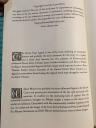 IMG_0385.JPG3024 x 4032 - 2M
 page68.JPG4032 x 3024 - 2M
 page44.jpg4032 x 3024 - 2MThanked by 1Vilyanor
 -
which font to use for Cyrillic
Try EB Garamond. RomanticStrings mentioned it earlier in this thread.
See attached, look under the illustration for page 165. It's from the book I just mentioned above. It's not a large body of text to look at but you can see what it prints like. The English type is Doves. IMG_0389.JPG4032 x 3024 - 2M
 -
Re: Solesmes style type-face
I took a look at the printing and find it similar to the free https://www.theleagueofmoveabletype.com/sorts-mill-goudy Sorts Mill Goudy
Maybe looks a bit sharper on laser than a traditionally ink-pressed page.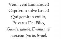 veni.jpg925 x 600 - 291K
 -
Sorts Mill Goudy could do with a revision to the kerning, which seems to be missing in the capitals. There is a bit of a gap between the first two letters in the previous example, though the Qui looks fine. While looking at that I notice most fonts have a problem with the Small Caps. fontex.pdf138K
-
It might be my desktop publishing software (Apple Text Edit) and not the font. Some examples of the V on the website look well kerned.
-
Yeah, I tried MS Word, and tried enabling kerning pairs in the font tab, and it kerns well now. (Font > Advanced > Kerning for Fonts...)Thanked by 1a_f_hawkins


Welcome to the MusicaSacra Forum!
To participate in the discussions on Catholic church music, sign in or register as a forum member, The forum is a project of the Church Music Association of America.
Categories
- All Discussions21,641
- General Music Discussion8,463
- Job Openings261
- Management of Music Programs855
- Choral Matters538
- Church Documents and Rubrics536
- CMAA Notes307
- Events751
- For Newcomers: Read First26
- Sacred Polyphony563
- Hymnody889
- Gregorian Chant: General2,738
- ↳ Graduale Romanum and Liber Usualis372
- ↳ Graduale Simplex60
- ↳ Semiology65
- Vernacular Plainsong702
- Anglican Use and Anglican Chant70
- Organ, Other Instruments and Repertoire447
- New Composition/Works in Progress1,327
- Recordings237
- Music for Hispanic Ministry162
- Music Education: Children214
- Music Education: General222
- News Items245
- Positions Wanted3
- General Discussion: Catholicism741
- Amusements182
- General Discussion1,043
- Opinions119