
Font Facts
-
I have long been a fan of Garamond.
This is the font that Bartlett used in the SEP and continues to use in the LC series.
Also, it is the font (in a derivative called Sabon) that the Episcopal Church uses in all its liturgical books (since the 1979 BCP).
EXCEPT
I was recently typesetting something and was trying to compare it the 1982 hymnal and realized:
The 1982 isn't in Garamond. It's BASKERVILLE.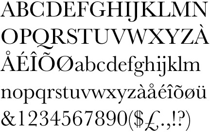
Not incidentally:
Baskerville is the most credible font (of the ones tested) according to a sneaky little test conducted by the NYT.
People are more likely to believe information presented in Baskerville than in other fonts tested (Georgia, Helvetica, Times, Comic Sans).
(I would really like this study to be repeated with a larger sample set and more fonts.)
So -- I find this really interesting.
ALSO:
In case anyone is wondering what font was used for the HYMNAL 1940, it was apparently Bulmer.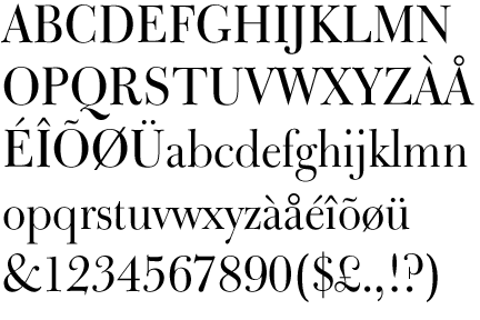
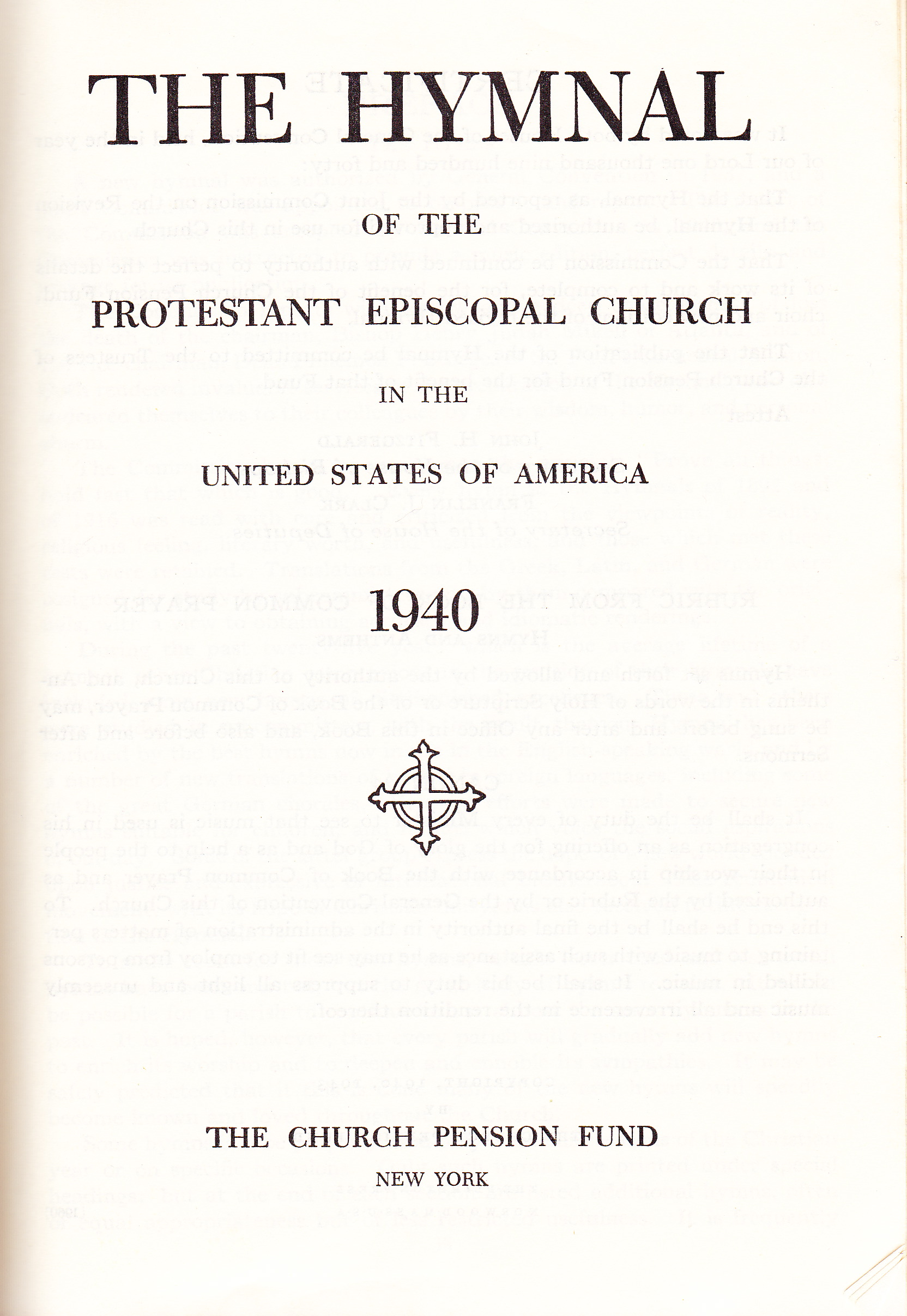
Bulmer was designed by William Martin, who worked in Baskerville's foundry (and his brother was Baskerville's foreman). -
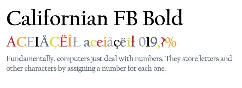
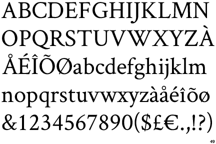
I have to ask, what do you make of "CalifornianFB?"Thanked by 1Gavin
-
it's a latecomer to being as widely available for free as Garamond was.
http://www.fontsquirrel.com/fonts/libre-baskerville
(I have not tested Libre Baskerville for print. It is optimized for web display.) -
NOW I HAVE A QUESTION
I think Baskerville and Bulman are both nice, but they both telegraph as Anglican to me.
Garamond somewhat --- but only because of association, not because they look particularly English.
SO, I wonder:
Either because of intrinsic style or because of association:
What fonts do you all think read as particularly Catholic / Roman / Latin ? -
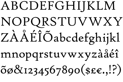
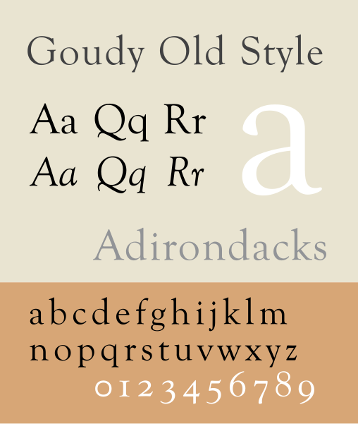
Goudy Old Style seems very Catholic to me. But that might just be because it's what I use.
-
What's your take on Adobe Garamond vrs the Classic font?
It's hard to say which version is the real one (though Adobe is "the newest member" of the family."
http://cdncms.fonts.net/documents/a0a1c46fe9cea024/ILGaramond.pdf
In real life I can't tell the difference. That is -- I cannot tell which one something is in isolation.
When staring at them side-by-side, I prefer Stempel Garamond over Adobe, and both of those WAY more than ITC Garamond. And I actually like Sabon least of all (because I hate the italic variation). -
I switched from Garamond to GoudyOS in 2005.Thanked by 1matthewj
-
I don't seem to have access to the variety of fonts referenced here. Of the ones available on my computer, I tend to use High Tower the most, after having switched from Garamond. If Goudy were available to me, I should doubtless use it. It is exquisitely tasteful and elegant, and has far more 'character' (whatever I mean by that) than either Garamond or High Tower. The Baskerville seems to me almost on a level with Goudy - Bulmer even moreso. The example offered above by Charles does not impress me as possessing grace and proportion, two characteristics of a font that would seem to be 'Anglican', or, for that matter, 'Catholic'. It is rather, um, artless - clumsy, actually.
Too, there are times when I use so-called 'Old English'.
As for 'the "G"', I think that it has a certain cachet.
Wood, who is so very often spot on, is spot off on this one. -
I too am a long time devote of Garamond however since last year I have switched to Crimson Text and I even though I have experimented with other fonts I keep going back to Crimson Text.
-
Can you tell me what font King's uses: I find the Italic "J" intriguing (c.f. In dulci jubilo, p. 18).
Nine Lessons and Carols 2014 -
I stopped using Times New Roman, simply because the name reeked of Bugninian Modernism.Thanked by 1bonniebede
-
I'm sure it's common knowledge, but what does Solesmes use?
I have been using EB Garamond, but the lack of bold yet has made me start experimenting with kpfonts (LaTeX). Would we describe kpfonts as a font family, since it has serif, sans serif, and mono, or is it a collection of other fonts? -
Jackson, could you please amplify your remarks concerning the CalifornianFB font, "It is rather, um, artless - clumsy, actually."? For the record, I didn't offer this font as an advocate for it, I just wanted to know Adam's learned and insightful opinion.
-
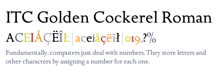
I love Golden Cockerel.
Times fonts are what you make adversaries read. They were designed to save newspaper. They are what you use for shrinkwrap contract. Do not use them for anything you want people to read.
http://www.fonts.com/font/itc/itc-golden-cockerel#product_topThanked by 1Adam Wood -
Can you tell me what font King's uses: I find the Italic "J" intriguing (c.f. In dulci jubilo, p. 18).
Nine Lessons and Carols 2014
That's Plantin. -
Charles: amplify my remarks? This is difficult. Actually I was being sort of tongue in cheek and mock snide. The California FB font does, though, seem to me rather clunky and lacking in the elegant and rarified artistry of something like Goudy. The proportions of the formative elements of each letter are less than perfect, and the chisled appearance, which is doubtless a deliberate feature, does not contribute to the letters, individually or in groups, being a pleasant aesthetical experience. This is not a font which one would use for an edition of the Canterbury Tales or a treatise on the theology of Hugh of St Victor.Thanked by 1melofluent
-
Oh, don't use mock snide. I can't tell your mock snide from the real thing.
-
What fonts do you all think read as particularly Catholic / Roman / Latin ?
Arial.
On newsprint. -
Bembo is intrinsically Catholic, being named after a Cardinal. Did he design it? Must look that up.
Golden Cockerel was also designed by a Catholic, Eric Gill, (for an edition of the Gospels IIRC; must look that up as well). He is also responsible for Perpetua, Gill Sans and the underrated Joanna.
Times New Roman too was devised by a Catholic, Stanley Morison, who is currently spinning in his grave after Stimson's comment. He loathed the reforms to the liturgy that he experienced (died 1967), and was a devotee of Gregorian chant.
For all my chant typesetting, though, I use Constantia. It just seems ... seemly.Thanked by 1Daniel Bennett Page -
Bembo = Catholic:
Dat kerning, tho.
Golden Cockerel was also designed by a Catholic, Eric Gill,
He is also responsible for Perpetua, Gill Sans
 the underrated Joanna
All nice Fonts. The Q on Golden Cockerel is awesome.For all my chant typesetting, though, I use Constantia. It just seems ... seemly.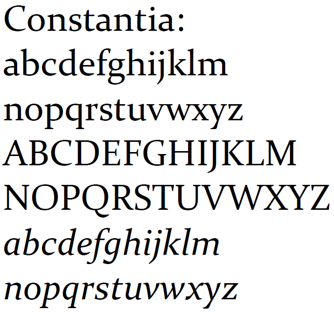
Can you provide a sample? -
Bembo was originally cut in 1495 by the Venetian punchcutter Francesco Griffo, and named for the poet/mystic/Cardinal (in pectore), but the modern version is a 1929 edesign by Stanly Morison for the Monotype Corporation.
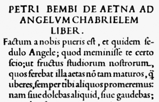
-
I love this stuff.
Here is a beautiful handwritten Book of Hours from the late 15th c., written in Humanist Miniscule, which is sort of the ur-script for all of these serif fonts we are looking at.
If someone has designed a typeface that looks like this, I want to know about it.
-
That's also the giveaway with Palatino (and Palatino Linotype):The giveaway with Garamond is the capital P. It doesn't close.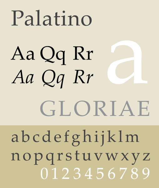
-
I am rather committed to using Linux Libertine (with old style ligatures) in my chant typesetting with LaTeX.
What is the deep and significant reason?
I first came across it as the default font on the old Gregorio typesetting page.
Thanked by 1Adam Wood -
I like the font used by the Typographia Polyglotta Vaticana for liturgical books in the early 20th century, e.g. in the Antiphonale Romanum. It's one of their so called Elzeviriane.Thanked by 1Adam Wood
-
I am rather committed to using Linux Libertine (with old style ligatures) in my chant typesetting with LaTeX.
What is the deep and significant reason?
I first came across it as the default font on the old Gregorio typesetting page.
I used to use Linux Libertine on my website, but I switched to Georgia a while ago. I can't remember why --- I think I had some technical reason for it.
I still use it on my resume and cover letters.
(Though, due to the "credibility of fonts" study mentioned above, I've been thinking about changing it to Baskerville.)
Also, I used to have "Linux Libertine" as my "Political Views" on Facebook, but I since changed it to "Fussbudget." I'm thinking my next official Political identification will be "Fogey"Thanked by 1bonniebede -
Goudy looks like a comic-strip car driving away.
This is the most insane thing I've ever seen you write. And that is saying something. :) -
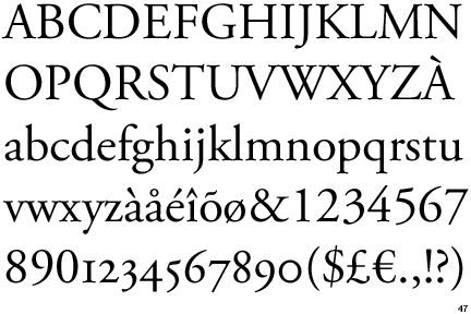
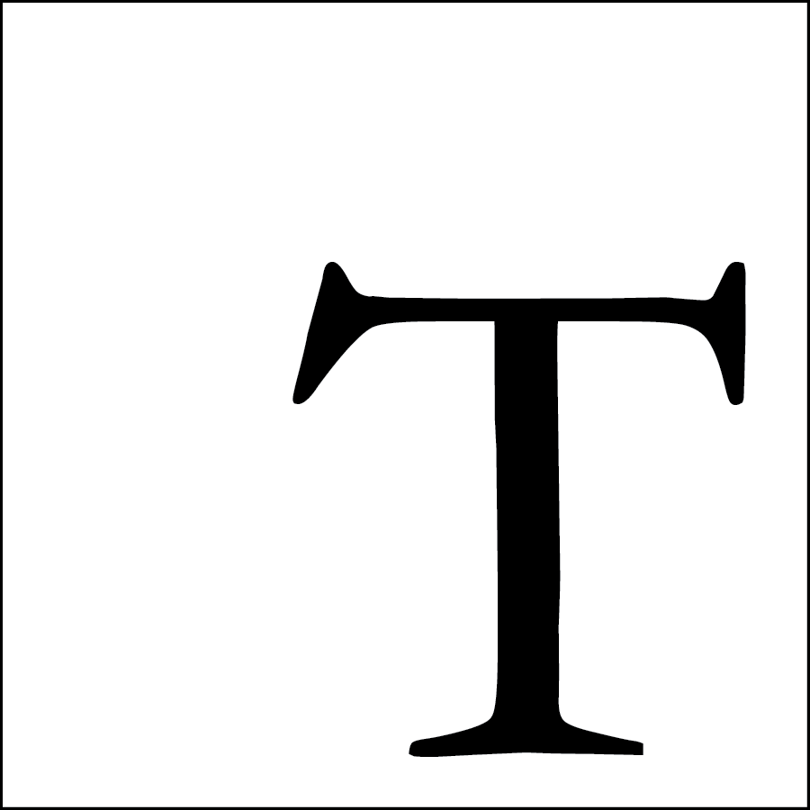
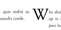
The single character that makes Garamond immediately identifiable is the uppercase letter "T" which has asymmetric serifs. No need comparing fine points of "V" overlapped with itself to produce the "W" (which, as pointed out above, is also the way "W" is styled in Goudy Old Style).
-
I had truly never noticed the asymmetric serifs.
I love details like this.
The base of Garamond's T also has a nice little curve on the bottom, like the arch of a foot.
(This image is comparing -- I think -- Georgia on the right)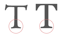 Thanked by 1Ralph Bednarz
 -
Yes, it is Georgia on the right. It illustrates why Georgia is better than Garamond as a display font. The subtle curves on the serifs don't digitize as well. Georgia was designed to work well on displays, while Garamond works better with print media (higher resolution). Incidentally, Libre Baskerville is also well designed for display use. Most of the better display fonts these days have a higher x-height, too, which allows better rendering on screen of letters such as "e".
-
The serifs on the Garamond example shown by Charles just above are different from the ones shown by Adam just above. In Charles' example the serif on the right side of the T has an outer face that is quite vertical, whilst the one in Adam's example definitely slants outward from bottom to top. Also, in Charles' example the top of the T's right arm slants ever so much downward as it approaches the serif, whereas the same arm on Adam's specimen actually rises ever so slightly as it approaches the serif, which, itself, does not extend upward quite as highly as Charles'. Further, a close look at the outer face of the left serif will betray that it is noticeably different, Charles' being a tiny bit convex and somewhat more pendulous, Adam's being rather lighter and ever-so-sightly concave. One could be forgiven for thinking these T's were from two different fonts.
And, details such as Adam points out on Garamond are why such fonts are far more aesthetically joyful and pleasing to read than those which lack them. One could be excused for feeling that fonts such as Garamond are the work of poets, and ones such as Georgia are the work of engineers.
I just looked up High Tower Text, which is one of my favourites. It is a 1994 'up-date' by Tobias Frere-Jones of a 1470 Roman font by Nicholas Jennings. In addition to the letters, I prefer the style of the numerals, wherein certain ones, such as 3, 4, 5, 7, 9, dip below the line - as they are supposed to do! -
I just looked up High Tower Text, which is one of my favourites. It is a 1994 'up-date' by Tobias Frere-Jones of a 1470 Roman font by Nicholas Jennings. In addition to the letters, I prefer the style of the numerals, wherein certain ones, such as 3, 4, 5, 7, 9, dip below the line - as they are supposed to do!

Delightful!
I particularly like the lowercase, which has a sort of playfulness to it. Look at the z especially. -
Um, how do you like the 'g'?
It seems to me that upper case R's are amongst the most difficult and least succesful letters of most any font, even of those fonts one really likes. The R in Bembo, given far up above, is rather unusual and pleasing as far as proportion goes. Constantia's is pretty good. Baskerville's is excellent. But, the one in Palatino is probably the nicest one (perfect, really) illustrated in this conversation. The one in High Tower Text and quite a few others is, actually, somewhat lacking in grace.
And, Goudy? As a font, it seems to be in a class by itself. None can match its artful elegance, perfect proportions, balance of light and dark, and utter, aetherial, refinement. -
Can you provide a sample?
I attach my speculative reconstruction of the commemoration of St Magnus, as it might have been sung at his shrine in St Magnus Cathedral, Kirkwall (Orkney) after Compline on his feast day (16 April), some time before the Protestant Reformation.
I find that 12-point Constantia sits particularly well with 48-point Meinrad (I know, I know, I am convinced by all the arguments for the superiority of Gregorio, but I am a humanities graduate and LaTeX makes my brain hurt). Memoria Sancti Magni.pdf40K
 -
I'm clearly struggling with MS Word as well! The second (blank) page shouldn't be there - and something funny appears to have happened to the staff lines in the course of conversion to PDF (using CutePDF Writer).Thanked by 1Adam Wood
-
never thought choosing Font have several effect .
I am using Gregorian from free typography site and mix with Helvetica Neue .
Because it feel so old yet new and clear to read .
this one example I use in our parish, Vespers in Mass Vesper-Organum.jpg1240 x 1753 - 249K


Welcome to the MusicaSacra Forum!
To participate in the discussions on Catholic church music, sign in or register as a forum member, The forum is a project of the Church Music Association of America.
Categories
- All Discussions21,616
- General Music Discussion8,453
- Job Openings258
- Management of Music Programs855
- Choral Matters538
- Church Documents and Rubrics536
- CMAA Notes307
- Events751
- For Newcomers: Read First26
- Sacred Polyphony563
- Hymnody889
- Gregorian Chant: General2,737
- ↳ Graduale Romanum and Liber Usualis372
- ↳ Graduale Simplex60
- ↳ Semiology65
- Vernacular Plainsong702
- Anglican Use and Anglican Chant70
- Organ, Other Instruments and Repertoire446
- New Composition/Works in Progress1,318
- Recordings237
- Music for Hispanic Ministry162
- Music Education: Children214
- Music Education: General222
- News Items245
- Positions Wanted3
- General Discussion: Catholicism741
- Amusements181
- General Discussion1,043
- Opinions119