Café refurb
-
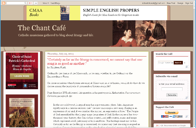
I implemented a new version of the Chant Café blog design on Wednesday night, only slightly different from the previous one, and already the happy customers are letting me know:Dear Editors of this Blog: Will you please return to the old blog format? The "new look" is unattractive and the typeface you have chosen very difficult for onscreen viewing. -- CatholicVoice
Oh, well. You can't please all the anonymous cranks who don't give an e-mail address or a screen image or anything useful to demonstrate what the problem is.

 sample8.png669 x 435 - 212K
 -
I have no problem with the Chant Café, since I don't often read it. I guess it has to do with reading the Forum, but I have sometimes already heard everything some of the writers have to say. I don't mean that in any bad or derogatory sense, just that I have heard their opinions on various topics and they have nothing new to say. As a retired librarian, one of the topics that often came up in group discussion at professional society meetings was information overload. It is real and everywhere these days. I don't know how anyone has the time to read all the blogs out there. I skim the Café on occasion and do see something useful from time to time, so it is not a waste of time. But I don't have time to check it daily.
As for appearance, it looks fine, and it looked fine to begin with. If anything, it is probably more legible to my aging eyes now than before the revisions. -
Looks fine to me, (and I am someone who usually whines and moans when a web-site I frequent decides to move or change even the most minute detail, thereby forcing me to take an extra nano-second out of my busy schedule to find a link I used to click on with ease....)As a retired librarian, one of the topics that often came up in group discussion at professional society meetings was information overload. It is real and everywhere these days.
LOL, I had no idea something I kvetch about has a respectable title!
I feel the same about that as I do, say, the sniffing one Catholic blogger does about Sanctus bells being "unnecessary for a liturgically mature congregation."
Don't we all hope that the liturgically immature are finding their way to the Mass all the time?
Likewise, old topics are always going to be new to someone.
(Save the Liturgy, Save the World) -
I noticed that RC, I think it's fine. It was kind of cute as a couple of weeks ago you mentioned you weren't disposed towards the use of color in text, but I'm glad you're tinkering.
CDub, each of the MS forums has, to my sensibility (if I have one), a different function. I have to strenuously disagree with you about whatever "we" have to say there has been said a thousand times before and why bother. Sure, that likely applies to my current and past posts there, but my idiomatic style seems to prompt some folks positively and others as an irritant.
However, the articles by Fr. Smith, Ms. Pluth and Mr. Wood of the past and actually of late are quite compelling sources for reflection. if you didn't read Kathleen's article on whether all hymns/songs are created equal, you're the poorer for not having her perspective. If you didn't read Mr. Wood's article comparing the arc of change within the musical tradition of the Churches of Christ to a similar arc in the RCC post conciliar world, then you've missed some fine thought.
The Cafe is a looser format as Tucker envisioned it. But to deem it redundant overload is a miscalculation, from one geezer know it all to another. -
What I said about having heard what some others have to say, comes from several years of reading their posts. For someone not familiar with their positions, it is new stuff. For me, it isn't. And yes, I pretty much know where you stand on things musical from reading your postings. May your ramblings be eternal. LOL.Thanked by 1melofluent
-
Chonak, I dig the cafe revamp.
For one thing, comments didn't show on my iPhone, and now they do. -
Oh, Charles. There are brand new contributors, silly wabbit.Thanked by 1melofluent
Welcome to the MusicaSacra Forum!
To participate in the discussions on Catholic church music, sign in or register as a forum member, The forum is a project of the Church Music Association of America.
Categories
- All Discussions21,443
- General Music Discussion8,373
- Job Openings238
- Management of Music Programs852
- Choral Matters535
- Church Documents and Rubrics529
- CMAA Notes306
- Events740
- For Newcomers: Read First26
- Sacred Polyphony556
- Hymnody884
- Gregorian Chant: General2,723
- ↳ Graduale Romanum and Liber Usualis372
- ↳ Graduale Simplex60
- ↳ Semiology65
- Vernacular Plainsong701
- Anglican Use and Anglican Chant69
- Organ, Other Instruments and Repertoire442
- New Composition/Works in Progress1,306
- Recordings237
- Music for Hispanic Ministry162
- Music Education: Children213
- Music Education: General222
- News Items245
- Positions Wanted3
- General Discussion: Catholicism741
- Amusements179
- General Discussion1,042
- Opinions119


