
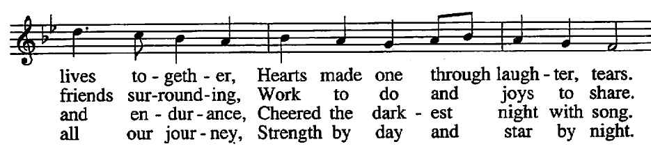
Text all scrunched together in Worship IV
-
Do you mean scrunched vertically or horizontally?
If horitzontally, it seems fine to me. What would you have had them do? Decrease the font size? Make the line only 2 measures? Make the page bigger?
Perhaps a bit too vertically scrunched. But I don't think that makes it harder to read/sing.
(edit: oh, you did mean vertically.) -
It's just wrong, in a variety of ways. They were trying to save space but avoid reducing the font size. It just doesn't work well. A smaller font size with properly spaced lines and a better font would have been a more readable choice. They put their B team on designing this.


Welcome to the MusicaSacra Forum!
To participate in the discussions on Catholic church music, sign in or register as a forum member, The forum is a project of the Church Music Association of America.
Categories
- All Discussions21,615
- General Music Discussion8,452
- Job Openings258
- Management of Music Programs855
- Choral Matters538
- Church Documents and Rubrics536
- CMAA Notes307
- Events751
- For Newcomers: Read First26
- Sacred Polyphony563
- Hymnody889
- Gregorian Chant: General2,737
- ↳ Graduale Romanum and Liber Usualis372
- ↳ Graduale Simplex60
- ↳ Semiology65
- Vernacular Plainsong702
- Anglican Use and Anglican Chant70
- Organ, Other Instruments and Repertoire446
- New Composition/Works in Progress1,318
- Recordings237
- Music for Hispanic Ministry162
- Music Education: Children214
- Music Education: General222
- News Items245
- Positions Wanted3
- General Discussion: Catholicism741
- Amusements181
- General Discussion1,043
- Opinions119