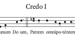
Typeface (aka Fonts) and only Typeface in use in worship aides
-
I'm curious to see what everyone uses. I'm going to keep it simple.
What I use/have used:
EB Garammond (2016-2023; 2024-Present *for now*)
Footlight MT Light (2023-2024; *I tried something new but went back after a year)
Hastegi (2024- Present *New to me, intend to use for headings/Titles) -
In worship aids, I wouldn’t necessarily apply another font for headings and titles. What I have mainly used:
Adobe Garamond Pro
for Simple English Propers (2011), Lumen Christi Missal (2012-), Lauds and Vespers booklets (2016-)
Elegant, timeless typeface.
New Aster
for Ad Completorium (2021), Kyriale parvum (2022)
Good proportion between width and height, which adds to readability. All editio typica from 1969 onwards have been set in New Aster
Palatino
for Klein Graduale, Antwoordpsalmen (2017)
Adobe Caslon Pro
for De zondag vieren (2022-) -
EB Garamond for everything - including chant and modern scores.
On special occasions, LDN Garamond Initials for the initial character to the Gospel.Thanked by 1ServiamScores -
EB Garamond as well. The original designer “finished” one set of initials so I added those when I discovered them.
-
Gerard, thanks for that link to the Garamond Initials. That's one I do not have and I like it. I've used something similar that's a knockoff, but it's not nearly as refined. I'll be making some pew cards with the ordinary for Advent, so I'll be purchasing this font for that.
For us, I use Iowan Old Style for all lyrics and body text. It is so elegant and yet very legible at small sizes. It is also wonderful for pointing text because there is a "black" (extra bold) option which really makes syllables pop.
Yana is used for our headers and titles, and is the daily driver for drop caps. (As an aside, there are some phenomenal alternate glyphs for capitals, so you can get really creative with drop caps.)
Optima for small annotations and cues, and for the credits, since it is very legible at extremely small sizes.
I'm attaching this week's worship aid which includes all of these fonts for reference.
 14th in OT (B • 2024) • Final Draft CORRECTED.pdf337KThanked by 1GerardH
 -
For most things I design, I use DTL Documenta (the font used in Gotteslob). The clients I regularly engrave for use Times, Minion Pro, Sabon, Garamond Pro, and Caslon.
For situations calling for a sans serif font, my current favorite is Marianne—which is the French national font, and very well designed. I also use Avemir and Optima.Thanked by 1Paul F. Ford -
I love Marianne.
-
Centaur has become my go-to.
It just... works.
 Lenten Oratory Leaflet 2024.pdf2M
 -
Calisto MT for titles (typically with Small Caps)
Book antiqua for music engraving (lyrics and such)
Though I'm intrigued by what a lot of people here have mentioned!!! -
In the past I have mostly used Garamond (the font of every blessing)
Recently, for my own music engraving, I've been using Baskerville. It is similar (but not exactly) to the font used in the Hymnal 1982. I find it it fits well under music. (Time New Roman, being slimmer, fits better - but looks like garbage). Most of the other fonts I like for text (Garamond, Palatino, Georgia) are a bit too fat for hymns. -
Ah, Baskerville, of course. I use it for the dropcaps in chant engravings.
Welcome to the MusicaSacra Forum!
To participate in the discussions on Catholic church music, sign in or register as a forum member, The forum is a project of the Church Music Association of America.
Categories
- All Discussions21,445
- General Music Discussion8,375
- Job Openings238
- Management of Music Programs852
- Choral Matters535
- Church Documents and Rubrics529
- CMAA Notes306
- Events740
- For Newcomers: Read First26
- Sacred Polyphony556
- Hymnody884
- Gregorian Chant: General2,723
- ↳ Graduale Romanum and Liber Usualis372
- ↳ Graduale Simplex60
- ↳ Semiology65
- Vernacular Plainsong701
- Anglican Use and Anglican Chant69
- Organ, Other Instruments and Repertoire442
- New Composition/Works in Progress1,306
- Recordings237
- Music for Hispanic Ministry162
- Music Education: Children213
- Music Education: General222
- News Items245
- Positions Wanted3
- General Discussion: Catholicism741
- Amusements179
- General Discussion1,042
- Opinions119


