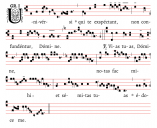
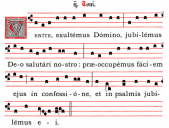
Red staff lines?
-
Any thoughts on red staff lines for chant? Gregorio offers it as an option, and a few books have it, although most just use black. Does it seem easier to read? Harder? More beautiful, or just weird?

 RedLines1.png706 x 574 - 55K
 RedLines2.png635 x 480 - 361K
 -
Old manuscripts sometimes have this, although in general I prefer all black. Black is more standard, and easier to read in low-light. Red lines on cream colored paper in low light… no thank you.
-
And natural red dyes were (and remain) the quickest to fade with exposure to UV lightwaves.
Welcome to the MusicaSacra Forum!
To participate in the discussions on Catholic church music, sign in or register as a forum member, The forum is a project of the Church Music Association of America.
Categories
- All Discussions21,443
- General Music Discussion8,373
- Job Openings238
- Management of Music Programs852
- Choral Matters535
- Church Documents and Rubrics529
- CMAA Notes306
- Events740
- For Newcomers: Read First26
- Sacred Polyphony556
- Hymnody884
- Gregorian Chant: General2,723
- ↳ Graduale Romanum and Liber Usualis372
- ↳ Graduale Simplex60
- ↳ Semiology65
- Vernacular Plainsong701
- Anglican Use and Anglican Chant69
- Organ, Other Instruments and Repertoire442
- New Composition/Works in Progress1,306
- Recordings237
- Music for Hispanic Ministry162
- Music Education: Children213
- Music Education: General222
- News Items245
- Positions Wanted3
- General Discussion: Catholicism741
- Amusements179
- General Discussion1,042
- Opinions119
