
Finale Medieval Font
-
I finally broke down and purchased the Medieval Font for Finale. Here's a sample.
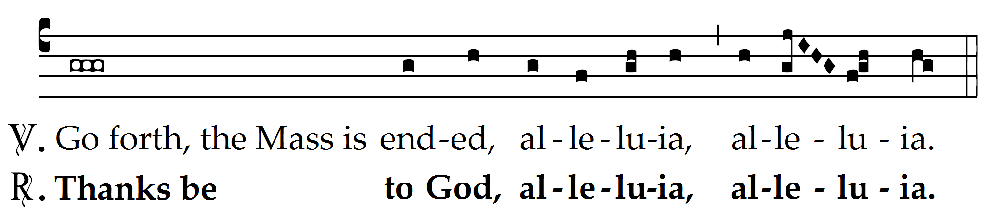
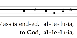 Easter Dismissal English.png2014 x 452 - 28K
 -
Not bad. I'm a Gregorio user, but it's good to see something for the Finale users that makes reasonably attractive output.
Thanked by 1Carol -
Does anyone if there Is a similar font for Sibelius? If yes, is it easy to work with? My husband prefers Sibelius, but he does have both programs.
-
You can laboriously make your own in Sibelius and save in a house style as one of up to 64 "notehead types". The last Alleluia above could be input as quarter-breve-whole-half, but the reciting tone and pes would then need a different notehead type. Some examples are:
http://www.cpdl.org/wiki/index.php/Canto_de_la_sibila (Cristóbal_de_Morales)
http://www.cpdl.org/wiki/index.php/Dis_tans_plus (Jehan_de_Lescurel)
http://www.cpdl.org/wiki/images/d/d2/Magnificat_primi_toni_%28Rore%29.pdf
Before I really knew what I was doing I did some hand-positioning of symbols & lines (2 parallel beam lines for the obliques!) in my Isaac editions:
http://www.cpdl.org/wiki/index.php/Dilexisti_justitiam_(Heinrich_Isaac)
http://www.cpdl.org/wiki/index.php/Summi_triumphum_(Heinrich_Isaac)
-
That does seem extremely laborious! Thank you for the links, though, I will point them out to my husband.
-
Still getting used to it, but I find it more comfortable to work with than Gregorio. I suppose it's just a matter of preference.
It's basically a plugin for Finale. It includes templates which automatically adjusts the staff lines. All notes are entered as quarter notes and the plugin automatically adjusts the meter. Once the notes are entered, you use the nume tool. It selects the most common groupings by default and one can cycle through various forms and even create custom shapes.
Best part is you can see the page layout in real time. Tweaking the spacing is still a little tricky, but I find it faster than Gregorio.
Does anyone know how to create red font text in Finale? -
I've been debating buying Finale specifically to use this plugin. I used finale years ago, then was a Sibelius user but switched to Dorico as soon as it was released. I've been happy as a clam with Dorico however it doesn't handle medieval notation yet. I imagine it will be a few years before it does and the developer of the finale plugin said it will be a while before he can port it over so I'd just better buy finale in the meantime... but oh do I despise it... although perhaps less than tools like Gregorio. sigh.
-
Mix, nice clean editions of the Isaac tunes. The chant is still in 5 line, non-Gregorian font with no reciting tones or final slightly longer note. I like the Finale plugin, as it is very clean, the cleanest I've seen. I still prefer my modified Anglican version of chant as it is the most legible for people who already read music. Things like double whole notes with hash marks on both sides are very difficult to read straight away unless it's on a line. There are only 3 basic note values: a black note (like a quarter note sans stem); a white note with head leaning right (actually a half note sans stem); and a larger white note with head leaning left (a whole note); and I use small grace notes with stems for any other small rhythmic deviation. I've found this reduces the chances for misreading errors, especially with my groups full of music readers and instrumentalists. The trick with Sibelius is knowing how to X-out stems for the whole piece. It's select all (command A)/shift/command/8. Also, for a line of text under a reciting tone, hold down the option key every time at the end of each word of text and hit the space key to make it stay under the reciting tone. Of course the words add to the left so you must grab the line and drag it over to a much widened bar to fit under the reciting tone. Here are samples we're chanting next week at Compline on Lent III with the ladies, which is very fast to imprint on my Sibelius 7.5. Tonight is Compline on Lent II, part of our Lenten Compline Series on 5 Sundays.
 4Psalm 63 SSAA - Full Score.pdf44K 3Jesu dulcedo cordium SSA Lent - Full Score.pdf27K 6into thy hands-women.2 in F_2015.pdf41K
 -
Hi Jefe,
The Lassus NASW uses black longa for reciting tones, which is indeed more easily legible than the white; I deploy it here:
http://www.cpdl.org/wiki/index.php/Magnificat_ii_toni_(Pierre_de_la_Rue)
I get best results attaching the block text to an invisible (hidden) note and leaving it centered: "My" under first chord, "soul[command-space]thirsts[command-space]for" &c under a hidden note, "dry" under another hidden note, or the re-expressed chord. Much less nervous-making than scooting text to the right and trying not to re-justify!
We were up your way yesterday, enjoying the sun and finding plenty of Dudlia along the North Fork AR but not a single Sonoran Blue Butterfly.Thanked by 1jefe -
Jefe, I've essentially done what you do; same notehead values (although I use double-wholes sometimes if the phrase is particularly long) however I don't fret about rhythms as we just sing the natural rhythm of the text. Our choir has gotten pretty good about feeling things together (and I constantly harp, "sing it like you say it!").Thanked by 1jefe


Welcome to the MusicaSacra Forum!
To participate in the discussions on Catholic church music, sign in or register as a forum member, The forum is a project of the Church Music Association of America.
Categories
- All Discussions21,615
- General Music Discussion8,452
- Job Openings258
- Management of Music Programs855
- Choral Matters538
- Church Documents and Rubrics536
- CMAA Notes307
- Events751
- For Newcomers: Read First26
- Sacred Polyphony563
- Hymnody889
- Gregorian Chant: General2,737
- ↳ Graduale Romanum and Liber Usualis372
- ↳ Graduale Simplex60
- ↳ Semiology65
- Vernacular Plainsong702
- Anglican Use and Anglican Chant70
- Organ, Other Instruments and Repertoire446
- New Composition/Works in Progress1,318
- Recordings237
- Music for Hispanic Ministry162
- Music Education: Children214
- Music Education: General222
- News Items245
- Positions Wanted3
- General Discussion: Catholicism741
- Amusements181
- General Discussion1,043
- Opinions119