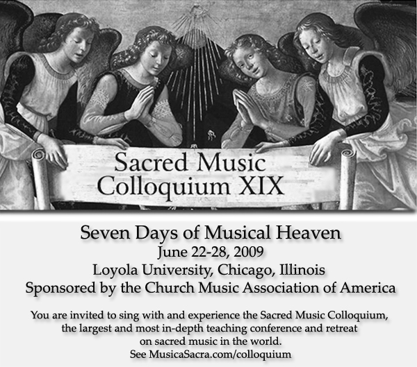
New ad
-
Not so hot but done on request. If this doesn't prove our desperate need for photoshopping talent (as in REAL talent) nothing does.

-
Oh, no. What happened to the picture? Especially their faces don't look too good.
-
hmm, looks fine here
-
Is it going to be back and white? There are black marks on the faces that I didn't notice before in the other places. (are they original marks in their skin? Sorry, I guess we women tend to notice the skin condition.) Also the whole picture is very dark.
-
I don't think one can be too critical based on the representation posted here. Image quality has to do with size and resolution and everything else. Thanks for getting this together so quickly, Jeff.
-
Sorry, I thought that's why CMAA desperately needed the photographer. I guess I misunderstood the whole intention of the post. I apologize.
-
Hi Mia
I just wanted to point out that what appears here is probably not an accurate representation of how the ad might appear in print material, etc. Varying media - varying results. That's all. :) -
I wish I could help. The poster in good size would be really effective. I already printed out the colloquium info and the schedule and posted in the music room. But the poster will definitely get people's attention.
-
Actually it is a half page ad
Maybe I will resize! -
There we go. See what you think now.
-
It would probably be good to crop the picture so that it's centered left-to-right.
-
If you sort of stand a bit to one side, it looks great.
-
I just printed out the poster. The picture looks much lighter in the print ! and the faces look pretty. (The picture came out half-sized from my printer, but it's ok. All the black marks on the faces are gone. Maybe my printer doesn't pick up all the small details of the 'blue ray' screen.' ) Thanks.
Welcome to the MusicaSacra Forum!
To participate in the discussions on Catholic church music, sign in or register as a forum member, The forum is a project of the Church Music Association of America.
Categories
- All Discussions21,451
- General Music Discussion8,378
- Job Openings239
- Management of Music Programs852
- Choral Matters535
- Church Documents and Rubrics529
- CMAA Notes306
- Events741
- For Newcomers: Read First26
- Sacred Polyphony557
- Hymnody884
- Gregorian Chant: General2,723
- ↳ Graduale Romanum and Liber Usualis372
- ↳ Graduale Simplex60
- ↳ Semiology65
- Vernacular Plainsong701
- Anglican Use and Anglican Chant69
- Organ, Other Instruments and Repertoire442
- New Composition/Works in Progress1,306
- Recordings237
- Music for Hispanic Ministry162
- Music Education: Children213
- Music Education: General222
- News Items245
- Positions Wanted3
- General Discussion: Catholicism741
- Amusements179
- General Discussion1,042
- Opinions119


