Boston's Holy Cross Cathedral restoration project - UPDATED
-
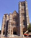
For those familiar with Boston's cathedral, the interior restoration project (which followed a beautiful restoration of the exterior that was completed in 2016 - see jpg at bottom - transforming what had long been seen as something of a grimy eyesore even 25 years after the removal of the elevated transit tracks that long and loudly blighted one's approach to the building) is now in the removing of scaffolding phase, allowing the contractors to post some photos of the nave (the sanctuary work continues). The expectation is for reopening by Paschaltide, and Richard Clark as the new music director will have the honor, privilege and challenge of building on his predecessor Leo Abbott's work in the newly restored space.
I thought some might be interested in this:
https://pbs.twimg.com/media/DsYB3_FU8AAi2kk.jpg
https://twitter.com/bostoncathedral?lang=en
When the cathedral opened, it was the largest in the USA - St Patrick's in New York opened a bit later. It's a similar size and volume as Westminster Abbey sans the Henry VII Chapel (some dimensional differences*). While James Renwick chose an academic Gothic for St Pat's, Patrick Keely did not with Holy Cross Cathedral - instead, Keely forthrightly used then-modern slender cast iron columns to create a more open space, with a stylistic sense that might be likened to Early to early Decorated English Gothic, though not an academic recreation thereof.
With the restoration, stone flooring will replace wood throughout - it will be most interesting to hear how that alters the acoustics of the space (it will certainly help reduce fire hazard).
http://holycrossboston.com/renovation/
* Holy Cross Cathedral (HCC)'s main space (narthex-nave-crossing-sanctuary) is 364 feet long. Westminster Abbey's same space - without the Henry VII Chapel that extends further in length - is 383 feet. (Holy Cross's main chapel sits to the north side of the sanctuary rather than extending English-style further beyond it - HCC's configuration is more like Ely Cathedral in that regard, though HCC's Chapel is nothing like Ely's). HCC's width in the nave with two adjacent aisles is 90 feet; that cognate width at the Abbey is 72' (which makes the Abbey appear taller by relative proportions). The width of HCC at the transept-crossing-transept is 170 feet; the cognate width at the Abbey is 174'. The vault of the nave and crossing of the Abbey is 102 feet. The cognate height of the HCC vault appears to be 95' (that datum, btw, is quite obscure to find on the Internet, but comes from two sources - a 1908 centennial history of the archdiocese of Boston and also from King's Handbook of the United States' discussion of HCC in its entry on Boston; what is usually reported as HCC's height of 120' is presumably to the ridgepole of the roof itself). The Abbey shares with York the title of tallest medieval English vault (but the Abbey's vault is stone, while York's like HCC is merely of wood) - most medieval cathedral vaults in England run between 65-85'.) HCC does not have the tribune gallery or triforium level of the Abbey.
Click twice to zoom in on pic:
 28833303025_ed479d12a0_k.jpg1668 x 2048 - 1MThanked by 1CHGiffen
 -
Liam, I am unfamiliar with the organ there. What do they have?
-
About a decade ago we replaced our wooden floors with stone and it made a notable difference in acoustics--better from singing, more difficult for speaking.Thanked by 1Liam
-
Charles - Specifications and an aural sample:
http://holycrossboston.com/wp-content/uploads/organ_specifications.pdf
https://soundcloud.com/pipe_organ/sets/hook-organ-at-boston-holy-cross-cathedral -
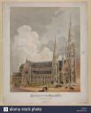
PS: For folks who are curious about the unfinished Cathedral towers, below was the original design intention, but the Cathedral fronts onto the original narrow neck of land that connected the former Shawmut Peninsula (Old Boston Proper) to the mainland but has since been surrounded by infill, and the towers ultimately would not support the intended spires. But at least one of the towers is has a set of five working bells from the former Holy Trinity parish nearby (which is another story - they are steel bells, purchased by the Jesuits then in charge of that parish from Confederate contraband seized by the Union after the capture of New Orleans - Confederate churches having sent bells downriver to be melted into armaments).
 cathedral-of-the-holy-cross-boston-mass-lccn2003653255-M7BJ22.jpg1121 x 1390 - 171KThanked by 1CHGiffen
 -
Thanks, Liam. A magnificent instrument. I have heard the organ at the Mother Church, just never made it to the cathedral. Maybe next time.Thanked by 1Liam
-
Thanks Liam for the thorough update on what has been for many a very long wait. Having decades-long memories of the Cathedral, I hope I’m not too shocked by the brightly lit cleanliness. I may miss the dinginess and creaky old wood floors. You really felt a warm connection to the past, a rather blue-collar past I might add.
Numbers 7 and 9 of the plan may prove to be the most startling innovations. I’m curious as to how this new pew rearrangement will be received by old-timers. Number 7, of course, involves repositioning the choir, which if I understand correctly, will face toward the altar at an angle. For those unfamiliar with the old set up, the choir sang not from the loft but from a confined spot near a side altar. That positioning was an acoustical challenge to put it mildly. (The choral sound from the loft is wonderful but the distance from the liturgical action is a formidable handicap.)
As to the organ, it is a local and national treasure. Every musician should be grateful for Leo Abbott’s almost single-handed efforts through the years to restore and maintain it. And of course, best wishes to Richard Clark in his new role as music director of the Cathedral.
Now about the parking . . . -
Not musically related, but with the restoration of the high altar steps, are they planning to return the tabernacle there? It would a shame to do all that work to and effectively have a bridge to nowhere...
-
The Blessed Sacrament is reposed in Its own chapel at the cathedral.
-
As in most cathedrals. The Blessed Sacrament should be in a place accessible for private devotion.Thanked by 1Jahaza
-
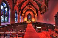
Here's a pic of the Blessed Sacrament Chapel at Holy Cross Cathedral, which was beautifully renovated in the 1990s work done in the Cathedral (during which work the color of the nave, transepts and sanctuary were finally rid of their post WW2 war surplus green paint....Randolph, it was a *green* collar past....and the parking that was abundant when the area was, um, grittier, has been superseded by the Silver Line, which at least is a much less of a transit blight for the Cathedral to coexist with):
 Holy Cross Cathedral chapel.jpg1075 x 705 - 800K
 -
A tanatising glimpse of an organ. Our whole church is smaller than that chapel, and the organ spec would be of interest.
-
I'm sorry to say that this looks like so many other recent cathedral renovations where the original architecture is more or less ignored and used as a shell for what's thought be mandated by Vatican II. The oversized amorphous sanctuary, the strange positioning of the pews and choir, and what looks to be unrelieved brightness of the lighting, all strike me as very "1990s."
I hope I'm wrong, but I'm afraid this will look as dated as the cathedrals in Milwaukee and Seattle do now. -
Re rich, as someone who lived in Milwaukee for 5 years, I can tell you that Holy Cross looks much better just by the lack of a “Wishbone Jesus” hanging out above the altar...
-
Pfreese, I can't open the image. Is this the infamous Christ the Diver sometimes called, Touchdown Jesus?
-
I unfortunately can’t seem to load the image from my smartphone. Here are some pictures from the repainting Conrad Schmidt did a few years back (they didn’t do the renovation):
http://www.conradschmitt.com/portfolio/projects/?projectid=67
Personally, I think Notre Dame’s “Touchdown Jesus” would still be more tasteful than what Archbishop Weakland picked for his cathedral on the eve of his retirement.Thanked by 1CharlesW -
Weakland should have been ridden out of town on a rail after being tarred and feathered. That thing looks awful.
-
Not too far off. It generated so much controversy that the Vatican had to get involved, though they eventually sided with Weakland. Even current staff at the cathedral have confided to me a certain dislike of the renovations (even their auxiliary bishop/rector), because it works for chrism masses and ordinations but basically nothing else. It’s a bit of shame, since musically that place has wonderful acoustics.
All this is to say the renovations to Holy Cross cathedral look lovely compared to what would’ve happened if Richard Vosko had been allowed to play around with yet another historic cathedral. -
I would not liken the HCC sanctuary reno as comparable to Vosko's work in Milwaukee. Vosko would not at all approve of the keeping of the OF altar to the bounds of the former sanctuary (just along the line of it, but still, let alone reinstate five steps to the reredos altar!), but would have gutted the sanctuary, and created a much shorter predella at the front of the crossing. Vosko is a worship-in-the-round fundamentalist of sorts, and HCC's sanctuary doesn't even kiss that idea. The new placement of the choir will be acoustically and functionally superior to where it's been in recent decades (the size of normal congregations at HCC is such that singing the Mass from the loft would involve too long of an acoustical gap - something I've observed in practice elsewhere back in the 1990s), and will allow much better access by the faithful to the small Lady chapel (off the south transept) that was uncovered during the 1990s reno work after decades of being boarded up. The shape of the new sanctuary predella is not amorphous but appears to be "inspired" by the shamrock (three angled lobes of three), design references with which HCC is historically replete (St Patrick being the patron of the RCAB). The flexible seating through the transept/crossing areas is aslmost certainly designed with Chrism and Ordination Masses and other odd liturgies in mind. I am glad to see the sanctuary rid of carpeting, but it would be prudent for some handrails to be installed along the shamrocky configured sanctuary steps. There's been no public mention of what is planned for communion rails for EF Masses, but flexible seating in that area could accommodate them. As for the lighting, the renderings are not indicative of the more modulated light in that area - the vault is of dark wood (painted - the design for which is being restored - in the apsidal arm of the space).
-
As for the organ in the Blessed Sacrament Chapel, this is all I can find:
https://pipeorgandatabase.org/OrganDetails.php?OrganID=9675
Thanked by 1a_f_hawkins -
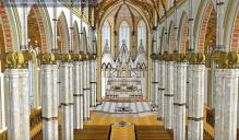
And, as for Unfortunate Liturgical Design Ideas that might have been inflicted on HCC with this restoration, I am quite grateful that an idea to bulk-out, faux marble-ize and crown (with an utterly inappropriate design) the cast iron columns (I assume to conceal utility/HVAC conduits) as shown in this rendering was reconsidered and set aside:
 Baker Lit Art original design concept for Holy Cross Cathedral.jpg1157 x 676 - 234K
 -
Probably 1881 Hook & Hastings, Op. 1047 rebuilt by Watersmith, Opus 29 (1995); unless that is elsewhere in the cathedral (the spec is plausible).
Bulking out columns is A BAD IDEA. Romilly Craze did it in Soutwark, so that he could add a clerestory, now they have monitors on each pillar to enable large congregations to see the sanctuary.Thanked by 1Liam -
Thanks for your comment, Liam.
I agree it could have been worse, and I hoping it's not as bad as I think, but it could have been so much better. Just when a serious and fruitful re-evaluation of the dominant liturgical thinking of the post-conciliar era is taking place, it seems that much of thought behind the HCC renovation is stuck in the 1980-90s. Even besides the liturgical positive / negatives, I'm always bothered by a basic disregard for the architecture. That space was never meant to have a shamrock or whatever shape the sanctuary now is. OK, it's better than the "altar in the round" concept, but still fitting a square peg in to a round hole. -
>
-
Still a beautiful building and magnificent organ. Next time I am there I have to see it.
Rich_enough, you touched on something interesting. One of my choir members said last night he had gone to the "contemporary" service two weekends because of scheduling conflicts arranging care for a very ill relative. He stated he was miserable there and that those people are still stuck in the seventies flailing away on their guitars and singing drivel. I would extend that to cover far too much of the church being like 50-year-old teenagers who never grew up. -
An altar 'in the round' can be okay, in a building in the round as here, (a round peg in a round hole). Designed in 1959, for a fairly conservative Archbishop, Heenan (later Cardinal Archbishop of Westminster).
-
Richard
I don't know if you are aware that only the center-front-most lip of the new sanctuary steps extends (but a few feet) beyond where the old sanctuary rail used to be. In the linked photo from a firefighters' requiem in 1964, you can see there was a clear wide area across the span from each set of transept doors.
https://www.bostonglobe.com/rf/image_r/Boston/2011-2020/2014/10/01/BostonGlobe.com/Metro/Images/TrumbullStreetfire_9.r.jpg
If this reno design were from the 1980s-90s, there would definitely be no restoration of the five steps to the reredos! -
I, for one, am delighted to see the demise of the carpeting, which not only wrecks the acoustic but also is hard to clean and not very attractive. The old pews were lovely, but there was a tiny step up to get into them. I consistently tripped over it, and I can only imagine how much worse it must have been for people with limited mobility. It will be nice to go to Mass there with less chance of falling over.Thanked by 1Liam
-
JL
I remember hearing from a friend who was involved in the 1990s renos that, at the dedication of the then-new altar, Chrism dripped onto said carpet, which had to be sectioned out and buried/burned and then replaced..... -
I heard of someone having the bright idea of wrapping an altar in clingfilm (plastic wrap) so that the oil would not stain it. Quite apart from probably invalidating the consecration, unwrapping the altar did not go well!
-
Reminds me of putting sand in holy water fonts.
-
Mini-update: For folks who remember the trip-inducing platform of the old pews in the Cathedral, the same but restored pews are being placed directly on the new stone flooring (click on the photos to zoom in for full resolution):
https://pbs.twimg.com/media/D01LY21W0AIYbMu.jpg
https://pbs.twimg.com/media/D01LSzEXgAEVTzb.jpg
And the Cathedral started this week to offer an opportunity for memorial or other donations towards the pew and kneeler restoration:
http://holycrossboston.com/pews/ -
Update:
A good picture of the restored nave posted yesterday on Twitter: https://pbs.twimg.com/media/D3kU-wuXoAE157t.jpg
https://boston.cbslocal.com/2019/04/05/cathedral-of-the-holy-cross-boston-archdiocese-renovations/
Schedule for Holy Week at link below:
http://holycrossboston.com/mass-times/
-
Btw, for folks interested in comparing this to Patrick Keely's work that survives in current US Cathedrals, here are links to what they currently look like: only the last two show any of the open-bracketing system approach to vaulting that Keely used in Boston:
Holy Name, Chicago (may I say: terrible aisle window glass): https://s3.amazonaws.com/architecture-org/files/modules/holy-name-cathedral-eric-allix-rogers-03.jpg
SS Peter & Paul, Providence: https://upload.wikimedia.org/wikipedia/commons/6/6f/Cathedral_of_Sts._Peter_and_Paul_Providence_RI_interior.jpg
Immaculate Conception, Albany: https://image.shutterstock.com/z/stock-photo-albany-new-york-june-an-empty-cathedral-of-the-immaculate-conception-on-the-morning-of-146016659.jpg
St Augustine, Bridgeport CT (not built as a cathedral): https://pbs.twimg.com/media/Dfli8ELXUAE_x3R.jpg
Immaculate Conception, Portland ME (too IMMACULATE in this reno - waaaay WHITE): https://i.pinimg.com/originals/57/75/e9/5775e9be856dd8bdc241e0846941d03b.jpg
St Peter's, Erie: https://media-cdn.tripadvisor.com/media/photo-o/0e/a6/5d/49/i-like-this-cathedral.jpg
But St Andrew's in Little Rock does use an open bracket technique in the nave (but not aisles): https://www.jpalik.com/3-Architecture/LittleRockArchitecture/slides/Little Rock, Arkansas-3686.jpg
And St Joseph's in Manchester NH does in both: https://www.catholicnh.org/assets/Uploads/TopImages/top-Cathedral-Interior.jpg
Thanked by 1CharlesW -
Don’t forget St. John the Baptist in Paterson, NJ (also with Mr, Keely’s famous open bracket work)
https://www.kofcknights.org/AssemblyPhoto.asp?ID=9384Thanked by 1Liam -
With the Holy Cross Cathedral having been opened in time for Holy Week (the new sanctuary furnishings were dedicated on the day before Palm Sunday), here are two photos that offer a basic comparison of the visual changes (the aural changes are significant: the cathedral now has a 6-second reverb)
Before: https://www.cruisebe.com/sites/default/files/portofcallobject/commons/1/13/Cathedral_of_the_Holy_Cross,_Boston_1.jpg
After (Easter Sunday 11:30AM Mass): https://pbs.twimg.com/media/D43Y9d9X4AcHKrZ.jpg
The interior also now has a modern climate control system (including air conditioning) and the attic also has a modern fire detection/prevention system.
And, just for one-post shopping reference, the exterior restoration comparison:
Before: http://1.bp.blogspot.com/-U2Cudb3Ad-w/TiRGo7Zu0gI/AAAAAAAACfM/x13LBEKh16c/s1600/IMG_1978.JPG
After:

 9adf1cdf9135ac8bf7ea726e728a20.jpg1668 x 2048 - 1M
 -
It looks cleaner and brighter. Is that Liam's limousine out front in that before picture? ;-)Thanked by 1Incardination
-
Me and limos don't get along.....
-
Liam,
How is the sound with the new choir seating arrangement? Where were you sitting?
Also, is that a piano I see? If Richard Clark only plays his own music I won't mind. . . well, not as much. -
I believe the piano is principally used by the music ministry for the Masses for the large local Spanish-speaking community (e.g., the mid-morning Mass on Sundays).
The organ, for now, is the Rogers electric organ - the balance of pipes of the venerable Hook in the gallery are still being restored and my understanding is that the Hook organ is scheduled to be operational sometime in June, at which point there will be another celebration.
I sat in my usual spot in most churches where I care about the music - towards the back of the front half, from which point I can help support fellow congregants best in singing. (For places for which I've learned the music is something to be endured, I have different logistical priorities in mind for my placement.)
Right now, the acoustical novelty is in balancing the amplification for *speech* - it's a much more reverberant space than was formerly the case, and the microphone-speaker distances have yet to be worked out. (My preference, as always, is for speakers to maintain a proclamatory tone and tempo as if they were not being amplified, and for mics to be placed further away from them....)
Singers, however, can sound wonderful with light or no amplification from their new placement in the south transept. Richard and the cantor Jamie sounded great. The miracle of marble floors. I've NOT been to a choral Mass there (11:30AM is just waaaay too late for this suburbanite's Sunday in the parking hellhole that is that part of Boston's South End, especially with the advent of the Sunday SoWa markets from now until the end of October), but I did record and listen to the major Holy Week liturgies on Boston Catholic TV (you can do so via its website, btw). One of my close friends who sang at the dedication and Chrism Masses said that, while the space has a proper cathedral reverb, it's not one choirs will have to fight because - unlike medieval cathedrals with all-stone interior surfaces - this 19th century cathedral's interior surface doesn't hurl back natural acoustical reverberation with a vengeance (though to my ear it does sound hostile for amplified speech for which the right balance will be the product of a longer work in progress).
The space sparkles* and the sound is lively. Neither of which are words with which I've previously associated this cathedral. The reactions of visitors are noticeably warm, receptive and marveling. I would consider this the end of one phase of a longer years-long endeavor that is more than the loving care of the fabric, as it were.
[I can anticipate criticisms from elsewhere of this interior renovation for failures to embrace what have often been considered benchmark conventional practices of the past thirty-five years: things like failing to put the main altar under the crossing, the restoration of the tabernacle in the old high altar (while there is a full Blessed Sacrament Chapel to the north) and restoration of the steps thereto, and failing to install an immersion font with flowing holy water near the narthex, et cet. I understand the bases for such potential criticisms, but I would not be offering them myself. I will note, however, that the beautiful font is awkward to actually use for anyone who is not a baby and perhaps even for babies - the width of the stone is perhaps too much. But that's just my sense of things. There will be many other opinions.]
* And also at night - all of the windows have been given night-lighting, which is a distinctly cooler-brighter LED K setting than the daytime setting (I've been there for the switch before the 8AM Masses - the 8AM Mass on Easter Sunday had perhaps upwards of a thousand people in attendance, more than the few hundred of Palm Sunday but even Palm Sunday was more than the usual few dozen for that time that would normally be in the Blessed Sacrament chapel. Newly Monsignored Rev. Kevin O'Leary was obviously pleasantly surprised).
PS: A note about the much-refurbished pews. Not only do they rest directly on the new marble floor, sans the former platforms that will not be missed, but they are spaced generously enough to allow easier movement of people passing seated congregants. In fact, far enough apart that people used to having seat supported-kneeling (as it were) might have less support than they were used to having. The kneelers are nicely designed.
-
Bonus trip back in time:
To fully appreciate the history of Boston's Catholic cathedral, one should understand that the city fathers decided to run an elevated train line directly in front of it - the Washington Street Elevated, which become part of the Orange Line of the city's hybrid underground-elevated rapid transit system. This line opened in 1901, just *before* the advent of the Irish-American machine's control of Boston's municipal politics, in case anyone is wondering how this could possibly have happened. The line was closed in 1987, and torn down thereafter, replaced by a sub-surface line several blocks to the northwest.
But, if you'd want to see - and even hear - how this train coexisted with the cathedral, take a gander at from roughly the 1:20-2:03 marks in this video, near the latter of which one can hear the train screech of a few seconds' duration that could be heard inside the cathedral.
https://www.youtube.com/watch?v=_QXoK2weC-g
When I first beheld the cathedral in its mid-1980s state (with the green-carpeted interior drenched in WW2-surplus paint of a bilious green hue - something that afflicted many churches after the war that had not had the resources to paint during the Great Depression and war years) in this context, I was shall we say distinctly underwhelmed. (Dingy was not an adequate word; nor was unloved.) The mid-1990s renovation was a major improvement, but the space wasn't all there yet in a properly cohesive way, with the acres of red carpeting being a visual but not aural improvement; by far the most successful parts of that renovation were the loving restoration of period detail to the Blessed Sacrament Chapel off the north transept and the discovery/recovery of the previously-walled off smaller Lady Chapel off the south transept. The other major work in the intervening years has been the mighty efforts of Leo Abbott to restore and conserve the great Hook gallery organ.
-
I was child ten years after WWII and green was everywhere. It was the color at the time. It mercifully went away, or the designers sobered up, whichever. The darker greens seemed to come back in the eighties.
I hope some good recordings are made on the Hook when it goes back into service - I will buy them. I have not seen the organ or the cathedral. I seem to get distracted by the Mother Church Skinner and don't get around to anywhere else.Thanked by 1Liam -
That green was like all the late 1930s cars on the roads in the early postwar Boom: it was a sign of 15 years of privation (first from the Great Depression, then wartime production and rationing). Churches that were not well endowed suffered a lot of neglect. Indeed, I believe that was the period is when the American Catholic church became addicted to pragmatic minimalism in so much of everything. First, you can see how designs for new churches in the 1930s became more cookie-cutter and furnished with commoditized art and furnishings. Upkeep in the older, grander churches was neglected. Pipe organs in some of those older grander churches perhaps began to rot; supplanted in whole or part by electrics. Then, after the war, the rush to plant new parishes in new suburbs, where building schools was prioritized over churches and, once there is a church, who can justify the initial and ongoing costs of a pipe organ when what most people want is a fast Low Mass that allows parking lots to fill and clear within 1 hour's time? The ground for reductive functionalism was plowed well in advance of the 1960s. That green is an emblematic token of that period.Thanked by 1CharlesW
-
Strange! I was around in the post-war era and don't at all recall any emblematic green. Nor any colour-decade marriage since until recent times when we have been cursed with the boring colourlessnes of 'earth tones', pale browns, off whites, blacks and greys, with perhaps some brownish mauve thrown in for (attempted) excitement. That has been the de riguer colour code for at least the last twenty years and it seems like it will never go away. It's as if people are actually afraid of colour. Now, harking back to the post-war years, the only 'vogue' colour that I remember for a few years in the late fifties was turqoise and/or aqua. We had two turqoise Chevrolets, and our breakfast room was painted my mother's favourite colour (at that time) - turqoise. I've never been fond of turqoise - wasn't then and amn't now. (I mostly don't like anything Turkish [Turqoise] - they stole Hagia Sofia from us and desecrated it.) Green, on the other hand? I think it's a good colour. In fact, these days most any colour is good --- when you can find it in a field of boring colourless 'earth tones'.
-
I remember well those greens in the fifties, but they tended toward lime and aqua. My aunt's house still has all the turquoise bathroom fixtures. Then there was the avocado period in the seventies, not to mention teal in the late eighties and early nineties. Earth tones such as brown and orange were big in the seventies, too. I don't even know what the popular colors are now. I stopped looking.
-
I just replaced a car and the predominanant colors in the show room were black and silver/grey and a smattering of red. For the daring/flashy personality there was electric blue or hideous burnt orange. MJO is right that earth tones have taken over, but what does it mean? Perhaps, people will only express themselves online, but not with a little color in their life? Who knows?
-
"Strange! I was around in the post-war era and don't at all recall any emblematic green."
I suspect you were not in a lot of the kinds of churches and institutional buildings that found it opportune to use army/navy-surplus paint.... It wasn't a color that was fancied in home or fancy office decor at the time. But it was used in a lot of places that had thin budgets before, during and right after the war.
You appear to have missed the jewel tones trends that came and went in the past generation. Rooms painted vibrant reds, golds, greens and blues. It got visually tiring, too. But you're in Texas, and the states on the southern border are (and have been for a very long time) Amurka's home of earth tones, including turquoise for preferred contrast. Up here in Yankee land, we not only have Federal-period homes in brick (sometimes stone) or gleaming but chastely colored clapboards, but lots of richly colored homes from the preceding colonial and succeeding Victorian eras.
PS: For exterior paints (and interior rooms that see lots of sunlight, even with blocking of UV rays by windows), there is a practical historical reason for reliance on earth tones (based in browns) and whites in subtropical and tropical latitudes and rich colors in latitudes in northern places: sunlight. Specifically, colorfastness. Rich reds and yellows (and their adjacent colors) that are not based in brown are very prone to fading sooner in areas with long seasons of harsh sunlight. It can pay to converse directly with the paint manufacturer about what its current year's paint formulation components are (they vary from year to year, and Consumer Reports and its ilk always report on a lag....) and which hues are more or less colorfast than others. -
If I may add something from a painter’s perspective, green is to be feared. Many painters won’t even attempt scenes with a predominance of that hue and in locales such as Great Britain plein air artists take a break from landscapes in summer. The green can simply overwhelm.
Since there is no green found in nature matching the greens sold in tubes by the traditional producers of artist paints, many of the more prominent artists instead create greens by mixing yellows and blues (each having warm or cool qualities thus giving a wide variety of results).
Here’s a test demonstrating the advantage and challenge of such mixing: what color is the north Atlantic ocean, even in summer?
[Answer: more often than not it tends toward a grayish green, thus you need to mix a blue, yellow with a touch of red. And no, you won’t get it right the first time around.]Thanked by 1Liam -
Ah, the color of the ocean has so many more variables if it's considered from the shoreline rather than at sea: not only the inherent color of the water, but the depth and coloration of the shore, the sun placement and angle, et cet.
I have say that some of the most beautiful shoreline sea water I've beheld in New England is at Block Island (even discounting the polarization used or affected to render this photo):
https://d3l69jicnm08r4.cloudfront.net/thumbs/gallery/dcf554b3f8a276889973c897ea550973994fdf22.jpg -
In the mid-60s the UK government wanted to differentiate traffic signs by type of road. They came up with a colour code providing non fading colours which always contrast with nature's range of greens and blues - based on greens and blues (click on 'Direction signs') and it works!there is no green found in nature matching the greens sold in tubes
Welcome to the MusicaSacra Forum!
To participate in the discussions on Catholic church music, sign in or register as a forum member, The forum is a project of the Church Music Association of America.
Categories
- All Discussions21,447
- General Music Discussion8,376
- Job Openings238
- Management of Music Programs852
- Choral Matters535
- Church Documents and Rubrics529
- CMAA Notes306
- Events741
- For Newcomers: Read First26
- Sacred Polyphony556
- Hymnody884
- Gregorian Chant: General2,723
- ↳ Graduale Romanum and Liber Usualis372
- ↳ Graduale Simplex60
- ↳ Semiology65
- Vernacular Plainsong701
- Anglican Use and Anglican Chant69
- Organ, Other Instruments and Repertoire442
- New Composition/Works in Progress1,306
- Recordings237
- Music for Hispanic Ministry162
- Music Education: Children213
- Music Education: General222
- News Items245
- Positions Wanted3
- General Discussion: Catholicism741
- Amusements179
- General Discussion1,042
- Opinions119


