
Forum color scheme
-
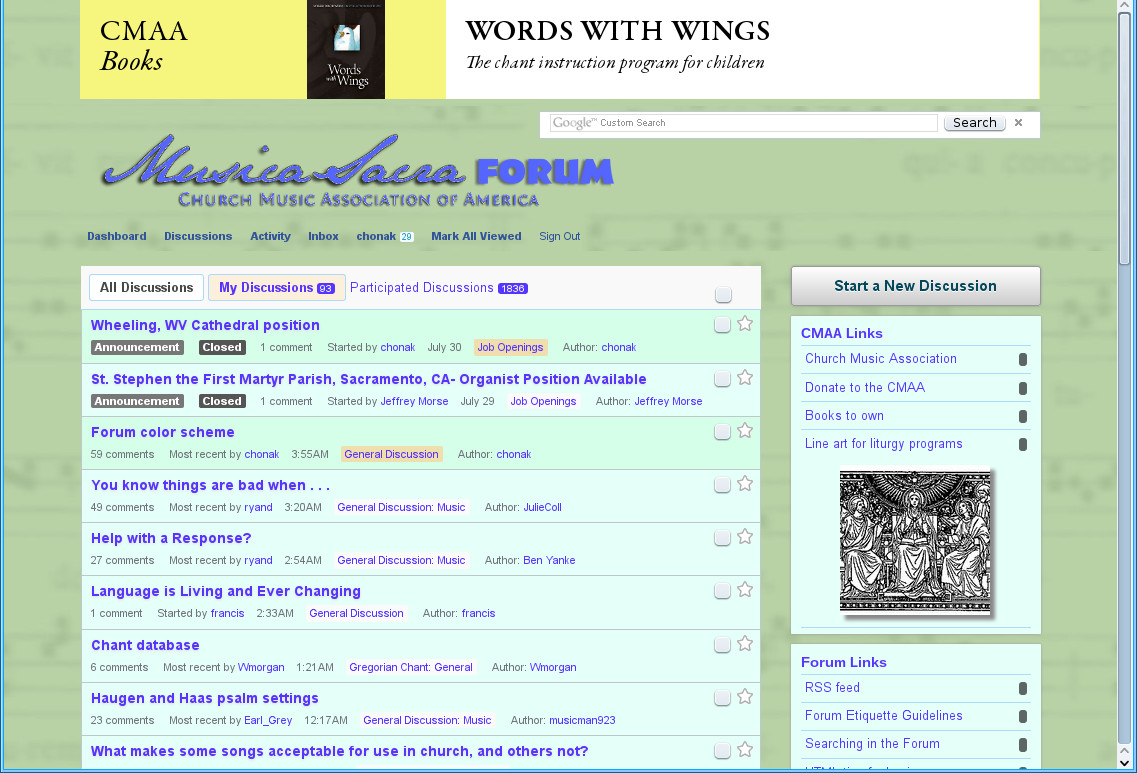
Well, before I switch the color scheme back, let me post what this one looks like, so that daytime readers can comment on whether they prefer it to the yellow/orange scheme in use heretofore.
 1137 x 773 - 239KThanked by 1CHGiffen
 -
The background is rather good. The lighter colors for the topics don't seem to have quite the right (matching) hue of the background (maybe a little too much blue in the mix). Also, an ever so slightly greater contrast between a user's color and that for the rest might actually be better on the eyes (which strain when two differentiated colors are too close).Thanked by 1francis
-
As a very old, nearly blind curmudgeon...I'd like to thank RC for just not having the site use a black background with white or yellow text (hint to other trad blogs!)
CDub, Adam.....consider the lillies in the field, the sparrows making neumes on telephone wires, the rhemora keeping the shark's skin parasite free, the....the....
Oh nevermind. (humming: Everything is beau-ti-ih-ful...)
Where are my glasses? -
I almost always read this Forum on my Kindle, in mobile view. So I've seen no change at all. Black, blue, white - very clean.
I'm in the midst of designing the new website for my Rotary club. This discussion is why I WON'T tell them that there's different themes. When it comes to artistic taste, ten people will give you 20 opinions. :-) -
I'm disturbed by the font type of the titles of threads on the main forum page matching none of the other fonts used.
-
I am tired of reading these posts. Can we just have the forum read itself to us as audio files and we can speak back our response?
-
-
Although I am kind of kidding, I absolutely love text to speech when I have good voices to do the reading. Cepstral has some great ones.
-
I like the current color scheme (8/1/2013, 4:51 pm EST) and faintchant background.
-
I may just put in the green background and let the rest stand. I have other stuff to do.
-
orange.
with yellow polka dots.
and animated fish kite puppets.
do it.Thanked by 1Adam Wood -
ooo! ooo! i like the fish kite puppets too! I will create the flash file!
-
Can't you just put that on your own web site, in the way people used to put animated fishtank backgrounds on their web pages?
-
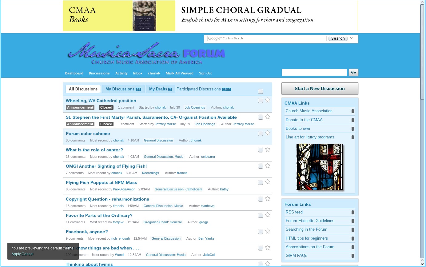
For what it's worth, here is the default color scheme that comes with the forum software. I think it's better than all this beige stuff.
 1385 x 868 - 230K
 -
How about an understated but warm palette of: Ocean floor, Fortune cookie, Sharky grey and Proletariat. "It's a beautiful thing."
-
Yes, I think so, too. If the blue hues are too cool, the subtle greens (especially of the background) of your previous screenshot really do seem to add a measure of warmth that all the beige misses.For what it's worth, here is the default color scheme that comes with the forum software. I think it's better than all this beige stuff.Thanked by 1ronkrisman -
Thanked by 1Ralph Bednarz
-
Mo betta bleu
-
That comic sums up why I have not offered any opinions on the look of this site.
-
Love the green!
-
Happy to have banished the beige.
-
whoa- is this the "Under the Sea" theme?
(am I really the ONLY one who liked the beige?)
oh, sorry- I wasn't going to offer any opinions.... -
Quasi convivium vices
-
I don't care if this is "One Flew Over the Cuckoo's Nest" institutional green, I'm not McMurphy and I'm feeling very serene and subdued, which should make many happy.
Now if we could get 101 Strings as site soundtrack....
I hear Nurse Ratchett calling me.
"Yes, Kathy, I love taking my meds." -
I like the green. It's nice and "ordinary".
-
I had to do something to it, since I'd worked on the other three CMAA sites this summer, and this one still looked pretty unappealing.
-
The green is not so bad.
But the baby blue is.
It's very bad.
-
I'd love a darker, deeper green. The blue, not so much.
-
Not a fan. I was going to post too that this minty green is the color of hospitals built in the 1960s, but I see melo beat me to that insight. It also doesn't work too well with the ecru of the comment background or the light blue of the new comment box. But really, I can live with whatever -- he who does the work is more than entitled to his color preference, I think.Thanked by 1CHGiffen
-
Most of the colors are taken from this palette, whose inventor called it "Ruined Culture". Others are based on it.
I chose the palette because it included the green from the background image, which became green based on a suggestion from Ben, so he deserves some credit for it.
A few things don't match yet: some blue buttons and the logo up-top, but I have some other things to do. 240 x 45 - 2KThanked by 1CHGiffen
 -
But really, I can live with whatever -- he who does the work is more than entitled to his color preference, I think.
Yep.Thanked by 1CHGiffen -
what about something a little more... white?


Welcome to the MusicaSacra Forum!
To participate in the discussions on Catholic church music, sign in or register as a forum member, The forum is a project of the Church Music Association of America.
Categories
- All Discussions21,117
- General Music Discussion7,599
- Job Openings1,307
- Management of Music Programs833
- Choral Matters519
- Church Documents and Rubrics504
- CMAA Notes291
- Events651
- For Newcomers: Read First23
- Sacred Polyphony528
- Hymnody821
- Gregorian Chant: General2,582
- ↳ Graduale Romanum and Liber Usualis354
- ↳ Graduale Simplex55
- ↳ Semiology57
- Vernacular Plainsong671
- Anglican Use and Anglican Chant66
- Organ, Other Instruments and Repertoire414
- New Composition/Works in Progress1,208
- Recordings222
- Music for Hispanic Ministry151
- Music Education: Children205
- Music Education: General214
- News Items242
- Positions Wanted58
- General Discussion: Catholicism723
- Amusements171
- General Discussion1,001
- Opinions113