
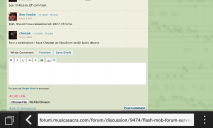
FLASH MOB (forum) SURVEY : Forum Color Scheme
-
On behalf of CMAA, (which I really do not have the authority to do) I am taking a flash survey on the new forum color scheme. Its been a few weeks and wondering what people think. Thumbs up or Thumbs Down.
I am putting two "thumbs" below to which you can add your thanks.Thanked by 1Gavin -
Thumbs UP!
-
Thumbs UP for "I used the selector at the bottom to change it to something I actually liked."
-
Thank this one if you like pressing "Thank."
-
I've given up worrying about such things years ago. It's not fantastic, it's not horrible. And I'm almost always looking at it in mobile view anyway.
-
Hate the green, but don't like green anywhere else, either. Changed it back to tan and blue.Thanked by 1chonak
-
OK.. so far it's 5 up and 1 down. Those who vote for both up and down simply cancel out votes on both accounts.Thanked by 1Gavin
-
Out of thousands of members on this forum, why are you (me included) ten people the only ones that contribute here?! Oh, I forgot. This is the Catholic Church.
-
So far it's:
6 like the green
1 doesn't like it
4 like the theme selector
There are 2089 registered users, and that figure includes people no longer using the site.
About 300 users have been on the site in the past 2 weeks.
Some people register but lurk and never post. And of course some accounts appear to be registered by spammers, though most of them never post anything.
-
chonak
What is the total number of individuals who have actually posted a message? -
I don't see that figure on display anywhere. Definitely over 1000 users have posted at least one comment.
-
It took a while to get used to it, but I think I like it.
Now, did I read somewhere that the color scheme is going to follow the liturgical calendar? So, we'll get some sort of violet (-ish) color for Advent? And then white (-ish) for Christmas?
And come Pentecost, will we follow the OF or the EF calendar? -
OK... all ten active members of the forum have voted. Thank you.Thanked by 1Adam Wood
-
Well, I don't mind 1960s appliances. But with the green, are we putting out the subconscious message that traditional church music is a 1960s appliance?
-
Thumbs up
-
Actually, I've become so enchanted with this tranquil shade of green/blue that I'm trying to find a match for it at Home Depot with Martha Stewart's paint. I think it's Bermuda Bay or maybe it's Tropical Lagoon. I can't decide which.
Thanked by 1Ralph Bednarz -
Thanked by 1JulieColl
-
OK... so the forum has gone 'green'
-
OK... so the forum has gone 'green'
Part of the ecoliturgical movement.
Thanked by 1francis -
Well, I know Martha's a Polish-American girl, so she's probably Catholic; I hope she's still practicing!
-
Ooooo. Purple! I'm sure Martha would approve. : )
-
Chonak
Advent and Lent? -
You can turn it on now if you want.
-
Chonak:
This is too cool.
I know this might be asking too much, but can you map this to the feast days for the year so we have liturgical colors appear properly for the day? It would be "truly neat" for the name of the Feast Day to appear at the top of the page, maybe in the dark purple at the very right reversed out in white.
Of course, time zones will be a problem. You would have to map IP addresses to a zip code table and then serve resulting colors. Could be a real pain. -
I know this might be asking too much, but can you map this to the feast days for the year so we have liturgical colors appear properly for the day? It would be "truly neat" for the name of the Feast Day to appear at the top of the page, maybe in the dark purple at the very right reversed out in white.
Of course, time zones will be a problem. You would have to map IP addresses to a zip code table and then serve resulting colors.
This is the most important project anyone has ever suggested for CMAA, I believe we need to immediately start a KickStarter campaign to fund it. -
Some browsers have not been displaying fonts well on the forum, so I'm putting in some changes to the fonts used.
-
Sorry.
-
(responding to Andrew's note before he took it out)
Ahem. A usable problem report contains the following information:
OS
browser
And is your handheld device using the full-page format or the mobile format?
-
Oh, Andrew, I don't mean to bat away your problem report. If it's really looking worse on your device, it doesn't hurt to say so. Previously, the fonts looked awful for Chrome users running Windows. That's why I put this change in.
-
Chrome on android, force desktop view: looking fine.
-
Revising the font selection order to try to help Andrew with his Blackberry trouble.
-
Ohh, the new one (10:38pm CST) hurts my eyes.
-
See 10:48 p.m. ET comment.
-
Doh. Should have remembered. Win7, Chrome.
-
Post a screenshot. I have Chrome on Vista here and it looks decent.
-
Note the difference between forum font and browser font ("Choose file").
 1280 x 768 - 138K
 -
Is that the difference between Bold and normal type in this font?
Choose File
Also compare Italic and Bold Italic.
To me (FireFox, Windows 8), they seem compatible. -
Chrome on Windows is notorious for bad font rendering, particularly anything embedded (@font-face). Chrome (a product of Google) cannot even properly render fonts from Google's own Open Font project.
Most annoyingly, this even affects rendering of client-side fonts. Many web pages use a font-family declaration: Use X if they have it local. Otherwise, use Y if they have it local. Otherwise, use Z. Chrome on Windows can't even render LOCALLY OWNED fonts correctly. (I recently added Helvetica to my desktop, and all the sites that had been failing over from Helv. to Arial suddenly looked like a complete disaster. Most versions of Garamond have the same problem.)
This has been a problem for several years. The Chrome Dev team recently announced that this will be fixed this year, perhaps in the next couple months.
In the mean time, @chonak and @anyone-else-who-does-web-dev: avoid @font-face, avoid Helvetica for body text (even as part of a font-family) and pretty much treat typography (for Chrome, at least) like it's still 1997 (Arial, Georgia).Thanked by 1Andrew_Malton -
Yay, thanks, we're back.
I feel like I just cleaned my glasses.


Welcome to the MusicaSacra Forum!
To participate in the discussions on Catholic church music, sign in or register as a forum member, The forum is a project of the Church Music Association of America.
Categories
- All Discussions21,134
- General Music Discussion7,607
- Job Openings1,312
- Management of Music Programs833
- Choral Matters519
- Church Documents and Rubrics504
- CMAA Notes291
- Events651
- For Newcomers: Read First23
- Sacred Polyphony529
- Hymnody821
- Gregorian Chant: General2,583
- ↳ Graduale Romanum and Liber Usualis354
- ↳ Graduale Simplex55
- ↳ Semiology57
- Vernacular Plainsong672
- Anglican Use and Anglican Chant66
- Organ, Other Instruments and Repertoire414
- New Composition/Works in Progress1,208
- Recordings222
- Music for Hispanic Ministry151
- Music Education: Children205
- Music Education: General214
- News Items242
- Positions Wanted58
- General Discussion: Catholicism723
- Amusements171
- General Discussion1,002
- Opinions113